Codu Redesign
PRODUCT DESIGN • RESEARCH

What is Codu.ai?
Codu is a product from Geektrust. It is an AI code evaluation assistant, the first in the world to evaluate for clean code. And that too, for any coding challenge, solved by your candidates. Codu looks for things that matter while writing production quality code - parameters that have not been automated until now.
Introduction
Codu is a coding challenge platform offered by Geektrust that helps developers showcase their coding skills to potential employers. By solving a Codu challenge, developers gain access to over 500 companies that are looking for talented coders. The challenges are designed to test a programmer's ability to think through a problem and craft a solution that is readable, maintainable, and solves the problem.
MY ROLE
Research, Experience designer,
Visual Designer
TEAM
Individual designer, reported to the Product manager.
TIMELINE
4 months
Dec 2022- Mar 2023
How does it work?
Below is a user story explaining how Codu works.

Why Redesign?
Was the redesign needed? If yes, then why?
We as a team sat down and tried to identify if Codu was serving it's purpose. We asked questions to ourselves
- What was the purpose of Codu?
- Why was it designed in the first place?
- Was Codu serving it's purpose?
So, Codu was designed for evaluating code written by candidates and allow the recruiters/ hiring managers to make decisions and take the necessary next steps. We realised that Codu was lacking a lot of things to fulfil this.
And hence, decided to re-design it.

Current state of UX
Let's analyse the product and see what's not working out?
Dashboard

Issues:
- The dashboard is overwhelming. Doesn't give any context of what's happening throughout the pipeline.
- There are a lot of unnecessary items on the dashboard like tags marked in the left navigation bar.
- Recruiters don't understand the criteria of clean code. Showing badges in the list makes it overwhelming for them to understand.
- All the action items are on the top left of the list, which is not the ideal place for CTAs. It's diificult to find the action items on the list.
- A lot of necessary filters are missing in the list.
- No sorting and bulk export is provided which holds a great priority in the recruitment process. If a recruiter wants to download the whole list and share it, there's no option provided for that.
Candidate Assessment Report

Issues:
- Action items are not easily accessible.
- The long scroll makes it hade to grasp information.
- No explanation given to how the scores are calculated and what all the grades mean.
- Comments are placed at the very bottom, making it hard to be discoverable.
Other Screens

Issues:
- The coding challenges listing page doesn't give much context about the problems + the UI is not appealing. The challenges doesn't look to be clickable.
- The small pop-ups for 'review code' and 'send test' doesn't give seamless experience to the users.
Identifying Users
Let's see who the users are and see if they are facing the same thing.
Codu primarily caters to three distinct user categories: recruiters, reviewers and hiring managers.
Candidates also use Codu but only for writing code. They receive a link, they open the link and start writing writing the code. So, they are not the primary users. That's why, candidates are not considered for the redesign goal.
We conducted interviews with 10 recruiters to gain insights into their feedback regarding the product. Here are excerpts from four of the user interviews, highlighting their valuable perspectives on areas of improvement.
Snapshots of the user interviews

Personas
After the user interviews, we tried creating personas for all the three user segments.
Personas has been generalised for representation purposes as they are too many segments. So, I am showing one general persona for each category.

Sumarising pain points of the users from their POV
Time-consuming review:
Manually reviewing every application can be a massive time drain, especially with large applicant pools.
Keeping track of everything:
With many candidates and positions, it can be hard to stay organized.
Lengthy Reports: Reading detailed interview reports, especially for multiple candidates, can be a time-consuming task.
Lack of Clear Communication: Unclear communication about expectations for interview reports or feedback on reports can lead to confusion.
GOAL
What do users expect from Codu?
Looking at the UX analysis and talking to the users, what user
Breakdown of the problem
What is missing in Codu/ what needs to be changed?
After the UX analysis and validating the problems with the users, below are the breakdown of the problem statement.
🗒️ Lack of information for new users:
New Codu users struggle due to the absence of contextual help, user guides, and explanations, hampering their understanding of the platform and its features, thus limiting their effectiveness.
🔍 Lack of basic functionalities:
Codu's absence of a meaningful sorting feature for assessments hampers users' ability to export data, diminishing organization and accessibility, and undermining user experience.
🔗 No clear ‘CTA’ on Assessment page:
In Codu, the clarity of the "shortlist, reject, or archive" feature is lacking, leading to user confusion about necessary actions. Additionally, users aren't notified of pending assessments upon logging in, risking overlooked tasks and delays in response.
📖 No dictionary for Codu’s language:
Codu's programming jargon lacks explanations, leaving users confused. Terms like "Readability" and "Maintainability" aren't clear. Actions like "Shortlist" and "Reject" aren't defined, and users are unsure about score calculations and what an "Average" code quality assessment means.
🔒 Hidden functionalities:
Codu offers team creation and custom assessment profiles without user-friendly interfaces. Integration with FreshTeam and upcoming Greenhouse integration is not transparent to users.

Objective
Since Codu is trying to advocate for developer's skill in the best way possible, there are a lot of gaps existing in the product. Our goal is to re-imagine Codu’s user experience such that users of Codu can easily find, understand and use Codu’s assessments.
Findings from UX analysis and the user interviews suggest that Codu is in need of clean and intuitive user experiences for upcoming functionalities, including:
🔸 Live coding capability on the platform, allowing users to actively code and showcase their skills in real-time.
🔸 DIY (Do-It-Yourself) functionality for creating and customizing problems empowering users to design their own coding challenges.
🔸 DIY Assessment profiles, providing users with the flexibility to create personalized assessment profiles tailored to their specific needs and requirements.
Solution ideas:
Use cases
Well, what all things users can do on Codu?
We aim to enhance the Codu platform by enabling the following features:

User Flows
Using user insights, we crafted user flows for an intuitive experience, helping users achieve their goals effortlessly.

Information Architecture
After analyzing the use cases and defining user flows, we strategically designed the information architecture for seamless navigation and intuitive access to information.

Wireframing
With the user personas, interviews, user flows, and information architecture as a foundation, we proceeded to create detailed wireframes that visually represent the planned user interface and interactions, ensuring a user-centered and cohesive design approach.
Note: There were multiple iterations of the wireframes.


------------------------------------------------------------------------------------------------------------------------------------------------------------------------------------------------------------------------------------
Depth of the wireframes for clear understanding:
Dashboard

Issues solved:
- The new dashboard shows the meta data (no. of new assessments, no. of test links expired etc.) giving idea to the users what is happening in the whole platform.
- The new dashboard is designed around job roles. (Recruiters generally care about closing an open job role asap). This would easen their task.
- Notification section is added.
- Settings is added which includes managing team, job roles, coding problems etc.
- A dedicated help section is added.
Listing page- Job role
After clicking on a job role from dashboard, user lands here.

Issues solved:
- This page is designed keeping in mind both the user groups: recruiters and hiring managers.
Recruiters care about basic information like score of the code, which language the code was written in and the coding problem solved. First layer of information is designed for recruiters and a expand button is given. WHen the users click on that, the row expand and the additional information is given (for HMs). This was done to reduce the overload of information on the screen. - CTAs are added with the row to ease up the experience.
- Export option is added to the list.
- Sorting is added to the list. Filters are also given more prominence.
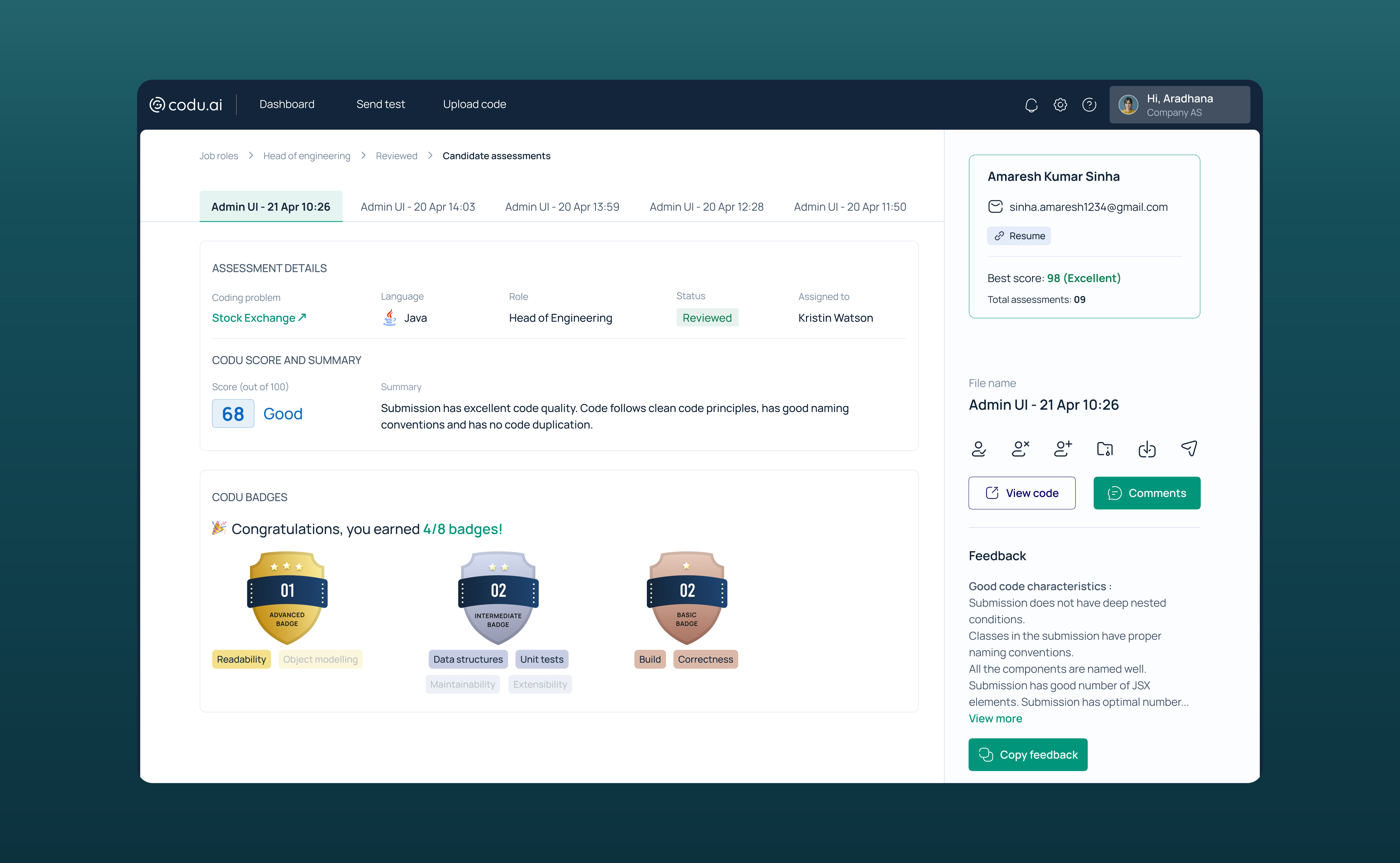
Candidate assessment report

Issues solved:
- The candidate report is designed in a way where all the action items are stacked on the right side of the page which is sticky to avoid confusion.
- UI is optimised in a where which reduces the scroll.
- Comments has been moved from bottom to right so that it doesn't get missed.
- Few lines of feedback are shown and a 'Copy feedback' CTA is given so that it doesn't get missed.
- Candidates information is given on the right which also includes their resume.
- If the candidate has solved multiple challenges, the tab has been made more prominent.
Style Guide
Below is the style guide for the redesign:

Reason for choosing this colour palette:
- Geektrust customer facing app has the same colour palette so to keep the design language similar, the same palette has been used for the recruitment portal. Also, blue justifies the palette as most of the recruiter platforms use blue in their palette.
Reason for choosing this typeface:
- Geektrust customer facing app has the same typeface so to keep the design language similar, the same typeface has been used for the recruitment portal.
Before/After
Below are the visuals of how the screen looks after the redesign.
Dashboard


Before
After
Assessment listing page

Before
After
Candidate assessment report


Before
After
Manage Codu
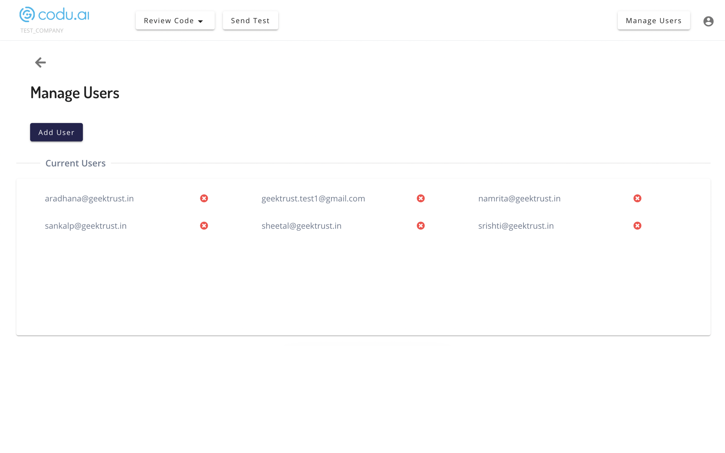

Before
After
Reflection
The new Codu is designed with a focus on user personas, including recruiters, hiring managers, and reviewers, to meet their specific needs and preferences.
Essential features like Sorting, Exporting reports, and Sharing assessment reports are incorporated to improve usability.
Attention to small details such as a Help section and Notifications is included to enhance the user experience and simplify tasks.
The dashboard is thoughtfully designed to reduce cognitive load by presenting relevant information and avoiding unnecessary clutter.
Backend features such as team and user creation, assessment levels, are now implemented in the UI, making the design more functional and seamless.
UI is changed so that the tool looks more professional and the design language matches with the guidelines of Geektrust.