
The Smart Resume
PRODUCT DESIGN • RESEARCH • VISUAL DESIGN

What is Smart Resume?
The smart resume shows off what a candidate is good at and what they've achieved in a neat way. It also lets recruiters and hiring managers ask questions about the candidate using a chatbot.
How this started?
In 2023, ChatGPT changed how Geektrust works. It made our AI tool old-fashioned and let anyone code easily, challenging our business. To adjust, we used our 9 years of hiring experience to make three new parts: Recruiter, Interview, and Candidate Agents. We listened to recruiters, managers, and candidates to fix problems with automation, making the process better for everyone.
Here, I'll take you through the Smart Resume: The Candidate Agent.
How does it work?
Below is a user story explaining how the smart resume works.

Introduction
Smart Resume = A resume which is smart.
It focuses on showcasing the candidate's expertise and achievements rather than solely emphasising their educational background or the prestige of their previous employers.
With this in mind, we had to design a resume that speaks for the candidate.
It aims to eliminate the manual screening + first round of technical interview.
MY ROLE
Responsible for research, conceptualisation, design, user testing and delivery of key modules and feature areas.
TEAM
Individual designer, reported to the
Product manager.
TIMELINE
9 months
May 2023 - Jan 2024

Problem Statement
Company Side
Recruiters often spend a significant amount of time reviewing profiles to find suitable candidates, but there's a low chance of a perfect match.
Additionally, hiring managers may reject profiles forwarded by recruiters, leading to wasted time.
Without a standardized format, scanning resumes takes around 4-5 minutes each, adding to the recruitment team's workload as they have to scan 100s of resumes a day.
Candidate Side
Candidates often struggle creating effective resumes as they lack the knowledge of what constitutes a strong one. They may have difficulty in showcasing their skills and expertise appropriately.
Additionally, not tailoring resumes to match job requirements can increase the likelihood of rejection.
How might we design a tool which empower our candidates by showcasing their skills well and help the recruiters by making them spend less time finding the best fit, while making it simple, delightful and uncomplicated to use.

Understanding Users
Let's see what users have to say?
Candidates:
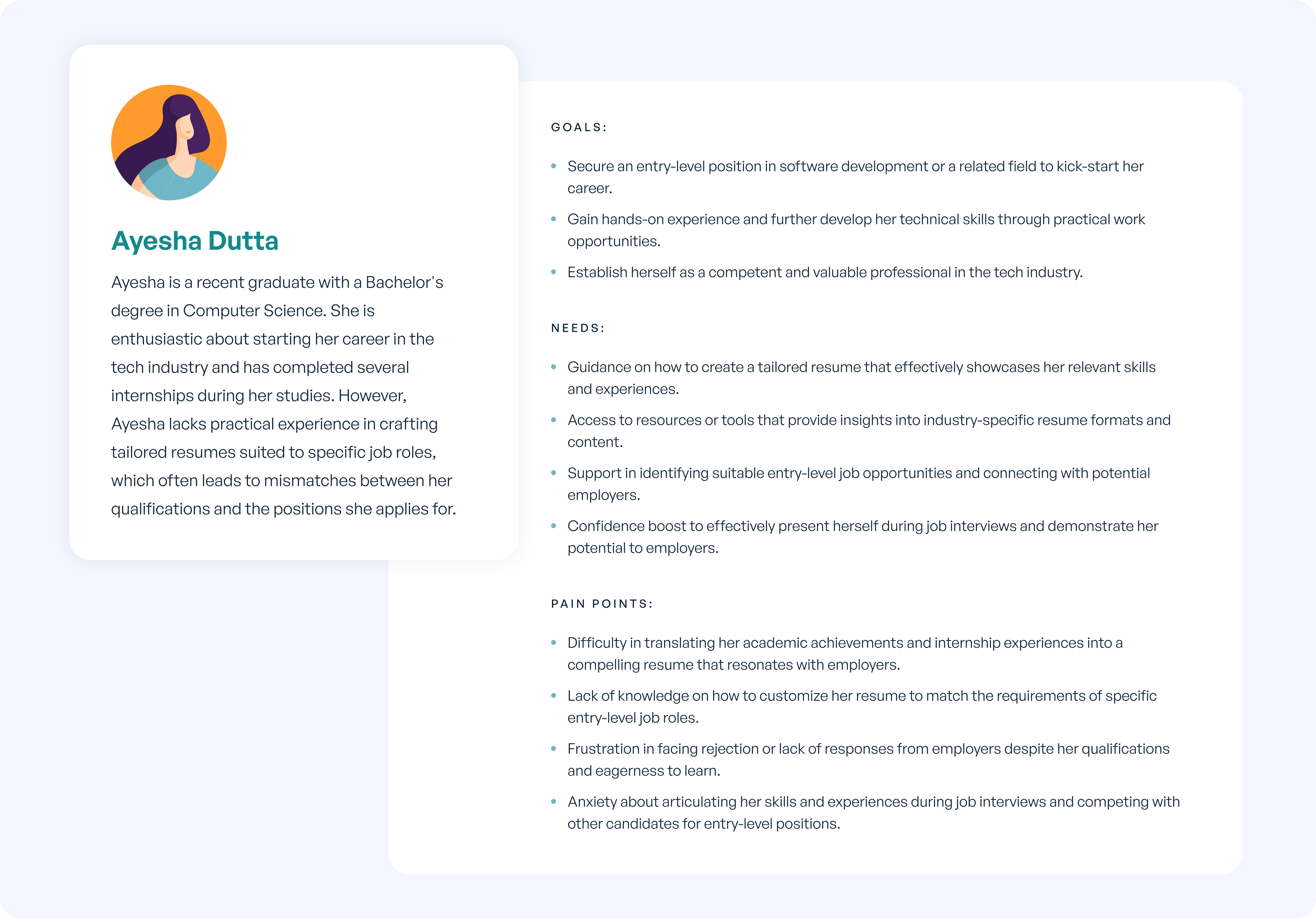
To understand the pain points of the candidates, we talked to multiple candidates and below were the statements they gave:
"I struggle with presenting my experiences in a way that resonates with potential employers, making it difficult to stand out among other candidates.
Vividh Vivek Raj (SDE, Blance)
"Understanding what employers want and showcasing it on my resume is a challenge.
Shivani Mehta (B.Tech, Dayanand Sagar Institutions)
"I find it hard to highlight the right skills on my resume, so I often feel like I'm missing out on job opportunities that could be a good fit.
Kumuda Mulgund (SDE1, Blinkit)
Now let's look at the recruiter's side.
To understand the the perspective of recruiters, we talked to multiple recruiters asking:
What do they expect to see in a resume?
What is the priority of information?
What are the matching constraints?
From where do they source profiles? What works and what doesn't work from those sources? etc. etc. etc.
Insights we got from all the talking:
INSIGHTS
Insights we got from all the talking:

Objective
To help candidates craft tailored resumes for specific roles. By empowering candidates to accurately represent their qualifications and experiences, we aim to increase their chances of securing suitable employment opportunities.
To create a resume where recruiters have to spend much lesser time and get the maximum amount of information which helps in decision making and they end up finding the best fit candidate for the job role.
Goals
What are users expecting out of the new resume?
Company Side
- Should be easy to scan through.
- Should have enough information for decision making.
- If recruiters forward the resume to the HM team, it should most likely be accepted by the HM team.
- Reduce the time of scanning data compared to how much time they spend today.
- If Geektrust is promising for screening and first round of interview, the screening and interview report should be elaborate so it's easy to understand how the candidate performed.
Candidate Side
- Represents their skills and expertise well.
- Can be customisable for different job roles they apply to.
- Remove any bias based on pedigree colleges/previous organisations etc.
- Doesn't take away their personality since it's created by someone else.
- Shouldn't look too different from a traditional resume so that the essence of a resume is maintained.
Solution
Looking at the insights and what we wanted to achieve, we thought of building a resume with the below features:

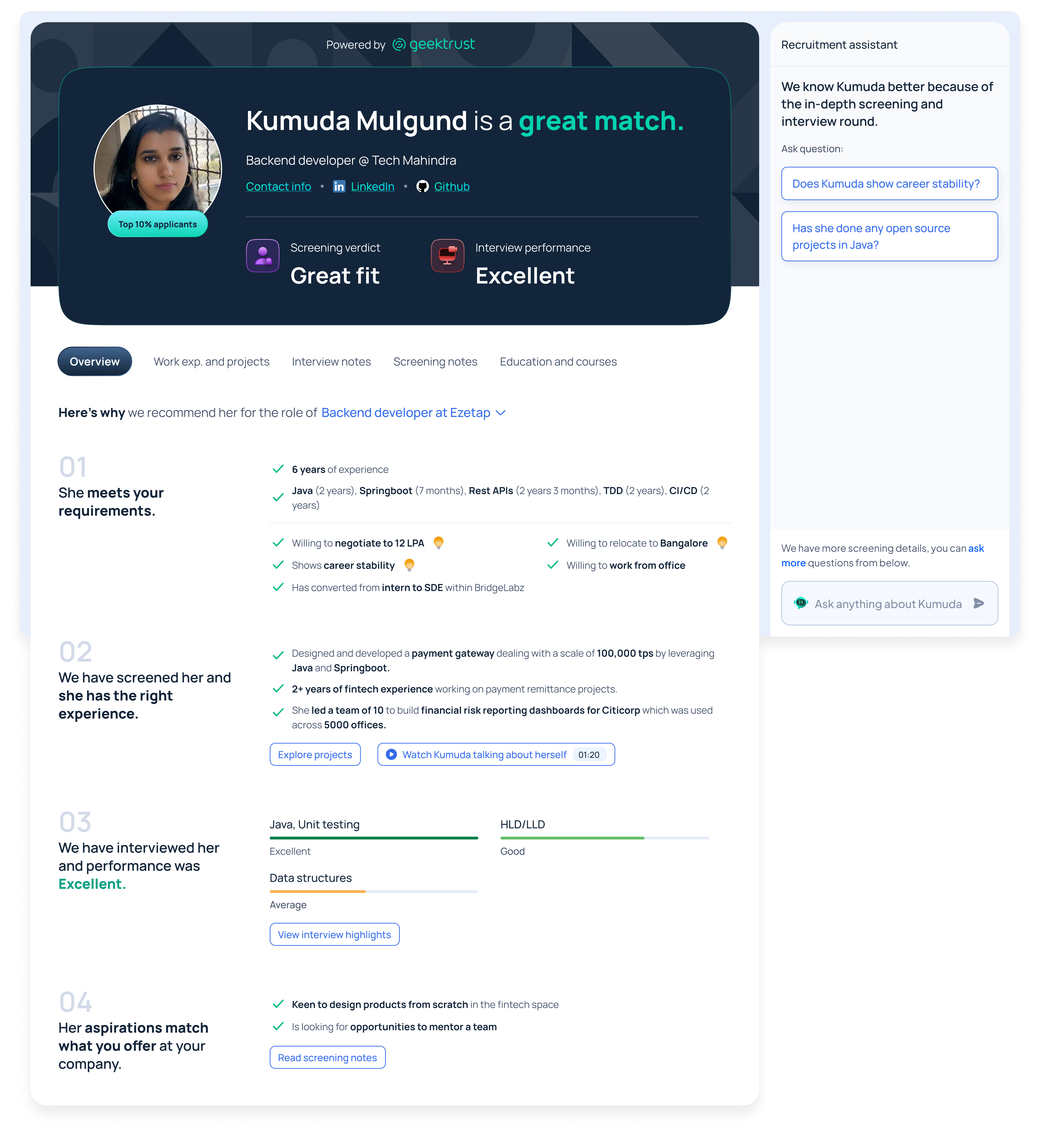
Overview
A section giving the summary of the whole resume so that the recruiters have to spend less time on the resume.

Matching parameter
Telling recruiters if the profile is a perfect fit for therole they are looking for.

Screening report
Geektrust has already conducted a thorough screening round. Showing the report of the same round.
Interview report
Geektrust has already conducted a code pairing interview round. Showing the report for how the candidate fared.
Chat feature
Giving a chat feature where recruiters can ask more questions which are not mentioned already in the resume.
Concept Creation
We need to design a resume with a summary section which should have a screening report, an interview report and a chat feature. So, I came up with this. :P

Feedback received:
- It's not coming out well if the profile is a best fit for the role they have applied to and if yes, why?
- It's not clear from the profile that the candidate has already attended screening and interview round.
- The paragraph about the candidate is hard to read and interpret.
- Screening report is missing.
- 'Vetted by Geektrust' tag is used to highlight that this skill has been tested by Geektrust. But it's not prominent. Since, it's a part of our offerings, it should be highlighted.
After multiple discussions and brainstorming sessions with the internal team, we landed on the final design.
Iterations:


After multiple discussions and brainstorming sessions with the internal team of designers, developers and recruiters; the design went with 20+ iterations (600+ screens), and we finalised on a version.
Final Design
Let's cut to the chase and see what we ended up designing. I'll explain the concept behind everything we opted for.


Breakdown of the design


As a team, we were confident about the design.
Let's test with the users and see if our confidence is broken or this works out for us?
User testing
After we were ready with out final version, we conducted user tests to see if the smart resume actually works.
☞ We start by introducing our AI-driven recruitment solutions and presenting a prototype for feedback.
☞ Users evaluate candidates using the Geektrust Smart Resume, sharing their thoughts and recommendations.
☞ Follow-up questions explore the Smart Resume's effectiveness and potential improvements.
☞ We conclude by requesting testimonials and anonymous feedback to refine our product.
Detailed structure of the user interview >>
So, did it work?
We conducted the test with 10 different users.
The insights have been categorised into 4 categories:


Key observations:
Users didn’t interact much with the chatbot.
Navigating through the smart resume was a bit challenging.
Expected all the important callouts upfront.
Adding voice of the candidate lit up their eyes. (Builds trust)
Liked the screening and interview transcript (Builds trust).
Confused about projects, skills and work experience.
Almost all of them ignored LHS and went straight to the RHS information. (Maybe because if color difference)
Really liked the amount of information in the smart resume (and the fact that they could explore more using chat).
Findings:
The concept really clicked.
But there were a lot of issues too. Below are the findings from the interviews:
The sense of overwhelm when they first land on smart resume.
Time taken to get a quick sense of whether the candidate is a match or not.
Lack of simplicity in presentation of data (projects, interview details etc).
The fact that no one realises the candidate is screened.
A recruiter has to search everywhere for obvious data.
The chat was unintuitive. How unintuitive it is to dig / discover more.
Matching the HMs expectations of how they evaluate each skill.
Final Design- Version 2
Looking at the findings from user research, we tried to solve the problems by our design.
To achieve the same, below are the changes made to the design:
The left hand side and right hand side were swapped.
REASON:
Users were less interested in interacting with the chat.
Overview section was brought outside as a separate tab.
REASON:
The landing page was overloaded with information.
Work experience and projects information were combined.
REASON:
Users confused the projects section with work experience.
Chat was given less space & shifted to right.
REASON:
Users hardly interacted with the chat. And they focussed on the data instead of the chat.
The chat section was changed to light theme.
REASON:
Users didn't focus on the chat (maybe because it was in dark theme).
Reasons why the candidate was shown in a prominent way.
REASON:
Users found it difficult to understand why candidate was a match.
Screening and interview performance was shown upfront.
REASON:
It was difficult to figure out that candidates were screened & interviewed.
Interview and screening notes were added as a part of the tab.
REASON:
It was difficult to figure out that candidates were screened & interviewed.


Learnings
- There was 2nd round of user testing and the product adoption % was much higher.
- Recruiters face a lot of issues in the recruitment process, it's just that they don't talk about it in open. We learnt about their pain points while the user interviews.
- People are still trying to get comfortable using AI led products. There is a bit of hesitation in a beginning.
- Even in an AI product, the 'human touch'(voice recording of candidate) adds a load of value.


