
Geektrust Design System
INTERACTION DESIGN • DESIGN SYSTEM • VISUAL DESIGN
What is Geektrust?
Geektrust believes in the mantra 'Code is your resume'. It's a developer-centric hiring platform. It assess coding skills and connect developers with companies seeking tech talent based on potential, not just past experience.
Code is your resume.
How does it work?
Below is a user story explaining how the Geektrust candidate app works.

Introduction
The user interface (UI) was getting old, so we needed an update to stay on top. I led the design team to create a brand new system for designing our products. This system gave our products a fresh look, fixed any confusing parts, and makes it easier for all our design teams to work together.
MY ROLE
Visual designer, Redesign the Geektrust candidate app,
Set up a new design system to maintain consistency across the products.
TEAM
2 Designers, 1 Product
Manager, 6 Developers
TIMELINE
6 months
Sep 2021 - Feb 2022

Current product(s)
Let's look at the current state of the platform

Geektrust candidate facing app

Geektrust recruiter facing app

Geektrust code assessment app
Geektrust internal app
These are the 4 different products of Geektrust. All the products have different design languages.
🥲 Inconsistency
As you can see, our product has many inconsistencies, be it in colors, components, guidelines…, which can have detrimental effects on the overall experience & the brand image.
🤯 Redundancy
For designers, not having a library of components means you’ll have to do repetitive design work to create your product screens. This also applies to the implementation, since developers would have to spend more time and effort to create new components.

Problem Statement
Our design process currently faces a challenge. With design assets spread across different agencies, it's become difficult to maintain a consistent look and feel throughout the entire product. To ensure a seamless user experience, we'd like to find a way to centralize our design resources for better collaboration and consistency.
Understanding users
Who are the users?
Users are going to be us - designers and engineers.
How does one go about creating a Design System for a complex and growing web application?
Why do we need a design system?
Won't it slow down the entire design process?
Why are we building this?
What is the problem we want to solve?
What does success look like? (for our customers, the business, etc…)
Who is this for?
What is the scope of this project?
"We wanted to reduce the development effort by identifying common components. Also, changing at one place should reflect throughout the app.
Developers (Geektrust)
"Without slowing down the process much, we wanted to bridge the connection between designers and provide a consistent experience for our users. Also getting the updates on the changes/additions of components to design system
Designers (Geektrust)
"Our products have many inconsistencies in colors, fonts, components, guidelines…, which is creating detrimental effects on the overall user experience & the brand image.
Co-founders (Geektrust)
Making sense of it all
🥲 Inconsistency
As you can see, our product had many inconsistencies, be it in colors, components, guidelines…, which can have detrimental effects on the overall experience & the brand image.
🤯 Redundancy
For designers, not having a library of components means you’ll have to do repetitive design work to create your product screens. This also applies to the implementation, since developers would have to spend more time and effort to create new components.
This led us to create the success metrics for the re-design that applications from the product should contribute to at least 50% of our overall applications as opposed to 20% currently and Profile completion rate should increase from 50% to 90%.

Process
How I went about it?
As I was also working on the new UI of the candidate facing product, I had to document every components used in the UI.
My first order of business was to collect all assets that might make my job easier, specifically Sketch files. Aside from a font file, there were none. Each and every design project started from scratch; new files, new artboards, new shapes, new symbols. My process involved taking a screenshot of the page I was working on and then designing on top of it. This was time-consuming, tedious, unscalable, and shameful.
⭕️
Simple
Clean out the clutter, and help users easily complete their tasks.
🧩
Coherent
Focus on user jobs and workflows rather than silos of information.
⚖️
Consistent
Establish design consistency to create a seamless experience for users.
✍🏻
Engaging
Encourage user interaction through well-designed prompts, CTAs, and flows.
⚙️
Personalization
Introduce features that allow for customization, enabling users to tailor their experience to their preferences and needs.
🖥️
Scalable
Design the interface to accommodate future growth and expansion.
Process
How I went about it?
As I was also working on the new UI of the candidate facing product, I had to document every components used in the UI.
I was re-designing the candidate app and working on the design system in parallel.
My first order of business was to collect all assets from the old files that might make my job easier. But unfortunately, each and every design project started from scratch; new files, new artboards, new shapes, new symbols.
Then I focussed on creating a new colour palette and type scale. I also created a basic style guide and presented to the stakeholders. After getting approval, I started created the visual screens and design system parallely.

I read about few design systems and learned the naming convention. I used the naming system to the best of my knowledge.


Evaluation

Working on our design system has been very challenging, but it has brought about many positive benefits for the company on different levels.
👩🏻💻
Development
This streamlined developers' workflow by enabling them to focus on features, using a unified language with the design team, instead of low-level UI elements like colors, spacing, components, interactions, and states.
✍🏻
Design
A ready-to-use component library simplified the creation of high-fidelity interfaces, reducing the time needed from days to just a few hours.
🔬
Experimentation
The design system enabled us to rapidly build prototypes, test more ideas, quickly evaluate hypotheses, and create additional variations for A/B testing.
Wireframing
With the research and aimed solution as a foundation, I proceeded to create detailed wireframes ensuring a user-centered and cohesive design approach.
Note: There were multiple iterations of the wireframes.
I was given paper wireframes and tasked with designing mid-fidelity wireframes to address the identified problems. Below is my proposed solution.


Issues solved:
- The dashboard lacks clear visual hierarchy, making it difficult for users to quickly identify important sections or actions.
- The layout appears cluttered with various elements competing for attention. This can overwhelm users and make it challenging to focus on essential information.
- The dashboard appears crowded with numerous sections, buttons, and text, resulting in a visually overwhelming experience for users. The abundance of information competing for attention makes it challenging for users to focus on essential elements.
- The navigation menu on the left side doesn't clearly indicate the current page or section, potentially causing confusion for users trying to navigate through the dashboard.

Result
The design language of all the 4 products came in sync now.
Below are the design language after introducing the design system:
Geektrust candidate facing app
Before

After
Geektrust recruiter facing app
Before

After
Geektrust code assessment app
Before

After
Geektrust internal app
Before

After
IN-DEPTH CONCEPT
Onboarding


What are we trying to solve and how?
Almost 50% of the profiles were empty because the onboarding wasn't well designed. It lacked clarity as to why the candidate needed to give this much information. And the previous onboarding had a long scroll form kind of UI which was tiring to fill.
To solve this problem, we broke the whole process into different steps: Basic Details, Work & Education, Preferences and Almost Done encouraging the candidates to fill one set of information and proceed to the next step. These steps were further broken down to sub-steps to reduce the cognitive load.
A progress bar was also attached to the steps indicating how many steps have been completed and which step the candidate is on.
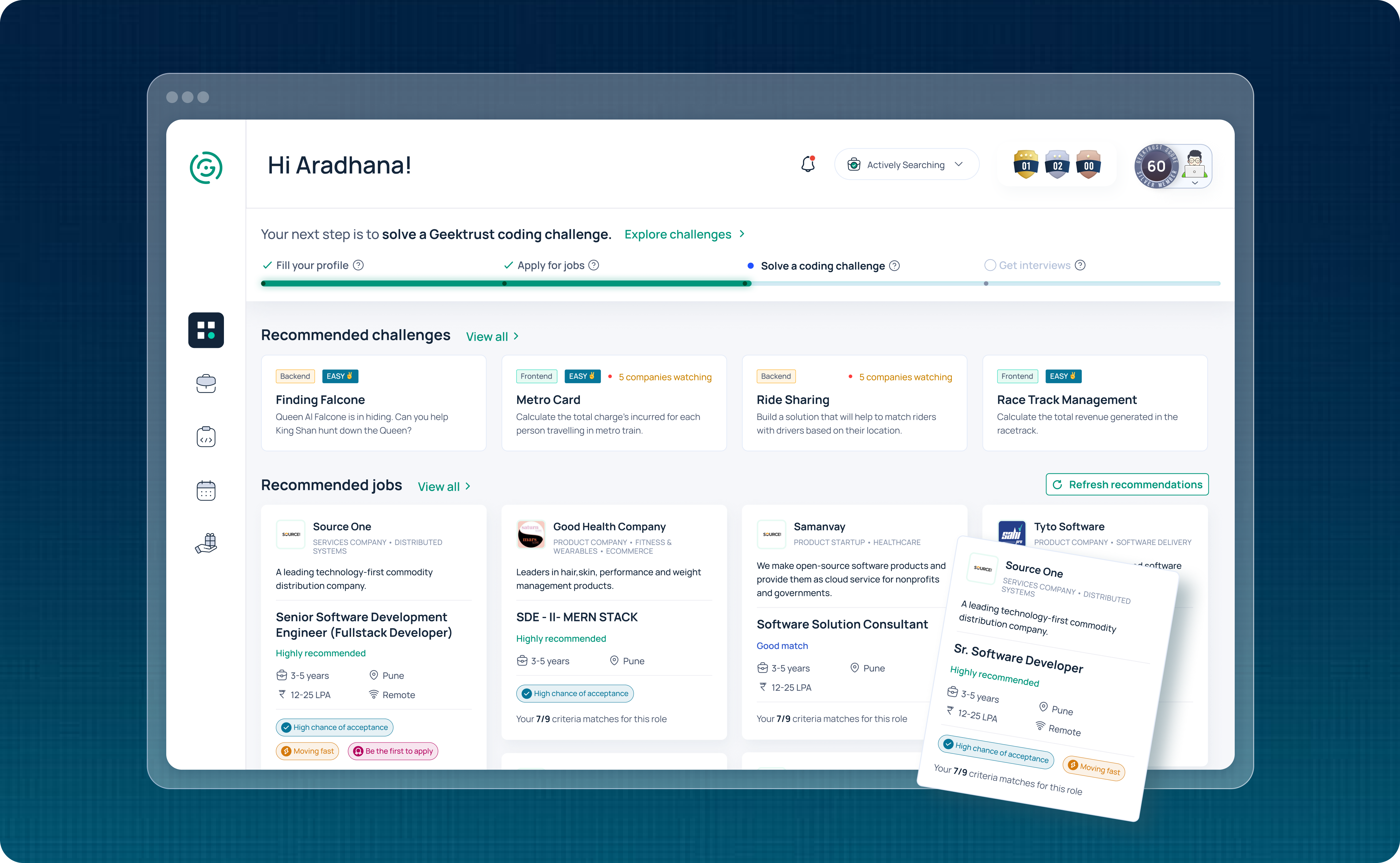
Dashboard

What are we trying to solve and how?
-
Profile

What are we trying to solve and how?
-
Job Listing


What are we trying to solve and how?
-
Badges

What are we trying to solve and how?
-
Benefits
This project taught me several things. It gave me the opportunity to study some of the best design systems currently in use and collaborate and learn from my development team. In the beginning, there was resistance to creating a design system. As a designer, it began to pay off for me immediately by allowing me to create mockups in a fraction of the time.
Some of the benefits of creating a design system include:
- Saving a lot of time
- Ensuring UI consistency (often associated with increasing brand trust).
- Reducing complexity and ambiguity.Enabling and facilitating collaboration and consensus.
- Creating a foundation for further improvement.
In sum, we argued that creating a design system would make us faster, better, stronger.


