High fidelity outcome
Final designs
1. Onboarding
Onboarding was designed in multiple iterations. Earlier, all the product features were explained in the onboarding. But upon testing, below were the issues found:
(a) Candidates often skipped the steps and missed how the product features worked.
(b) The process felt too long.
So, we changed it and just gave basic things required to get the interview started. And the interaction is such that the candidates don't miss anything given while onboarding.
Below is how the final onboarding looks:
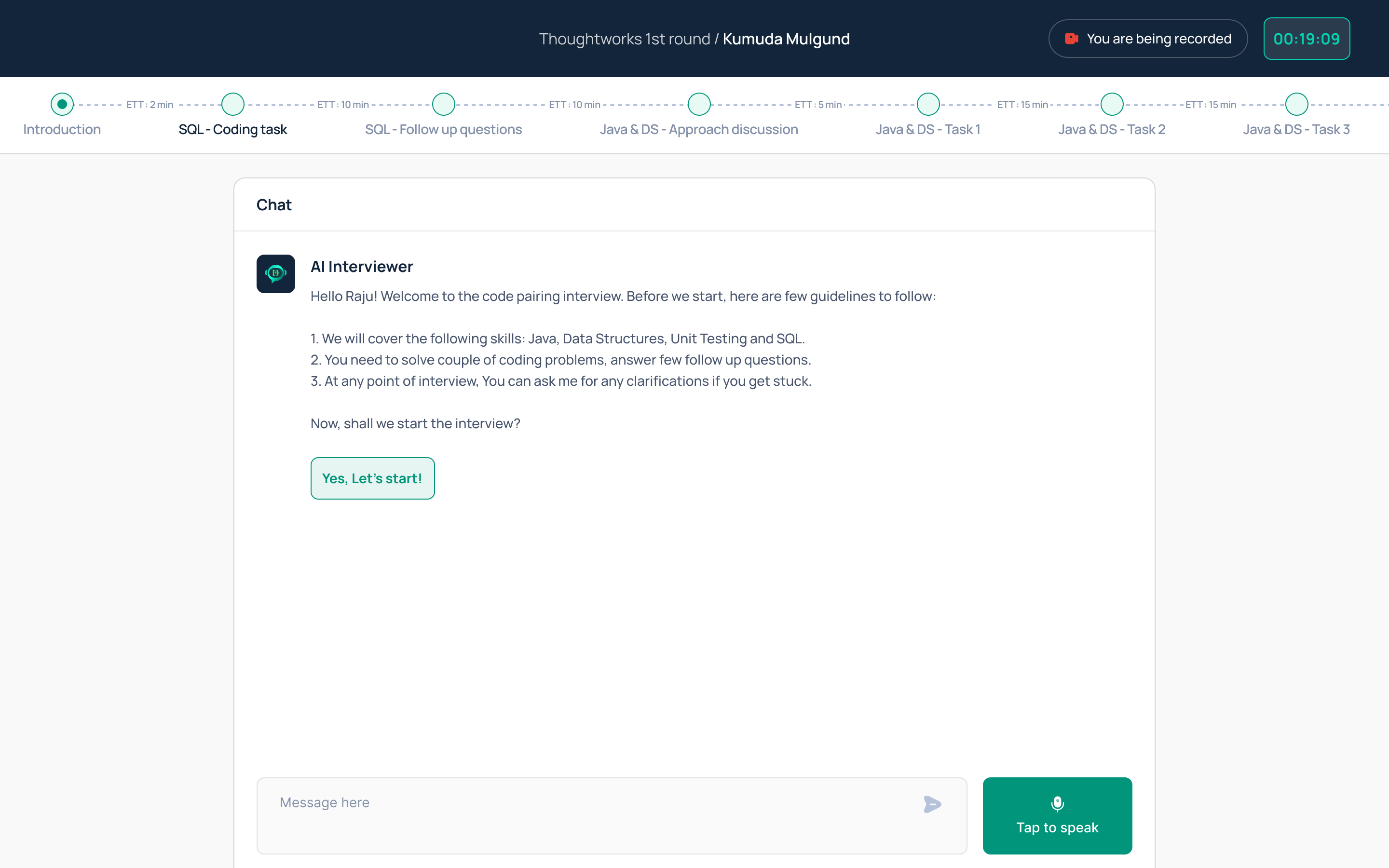
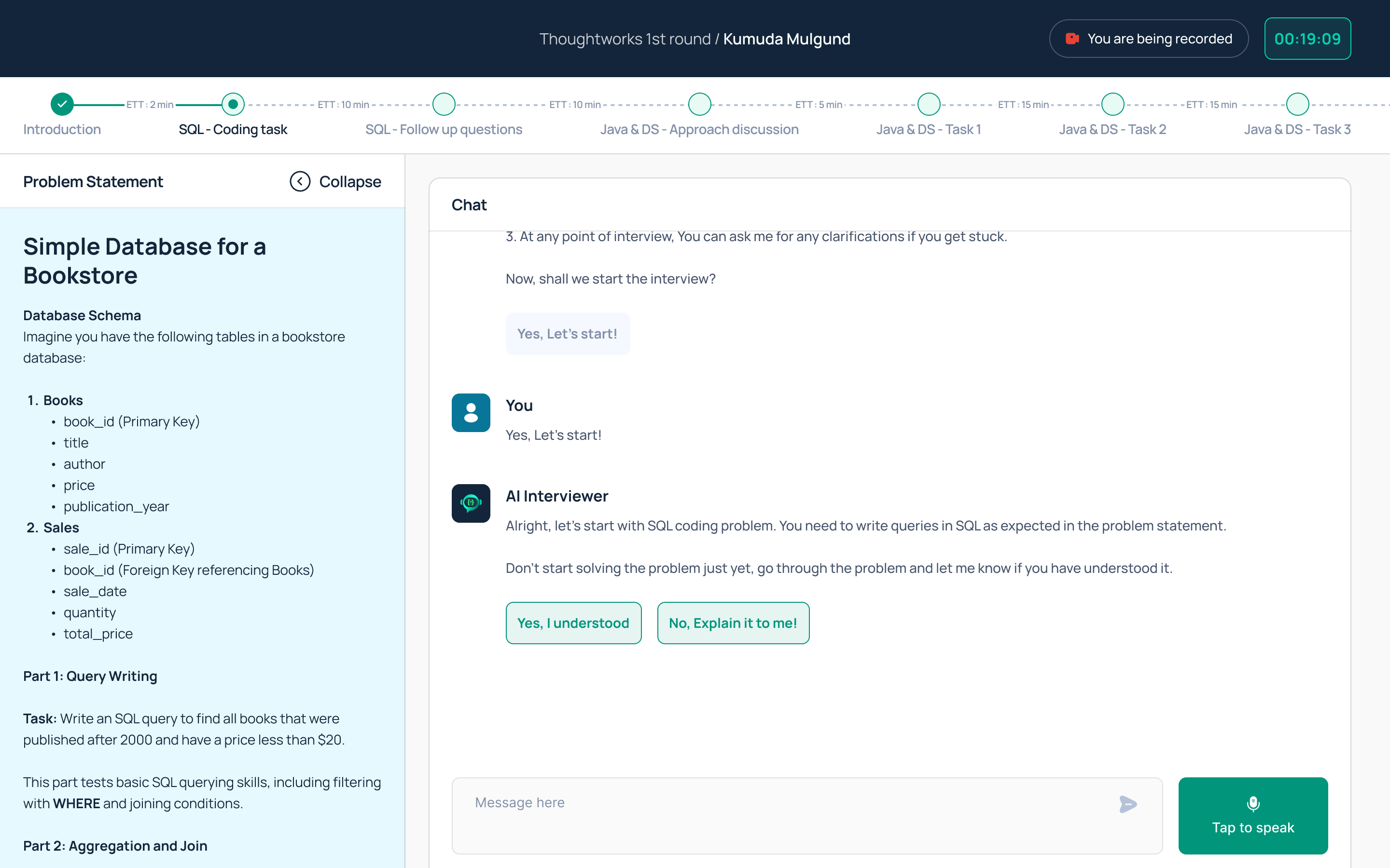
2. Introduction
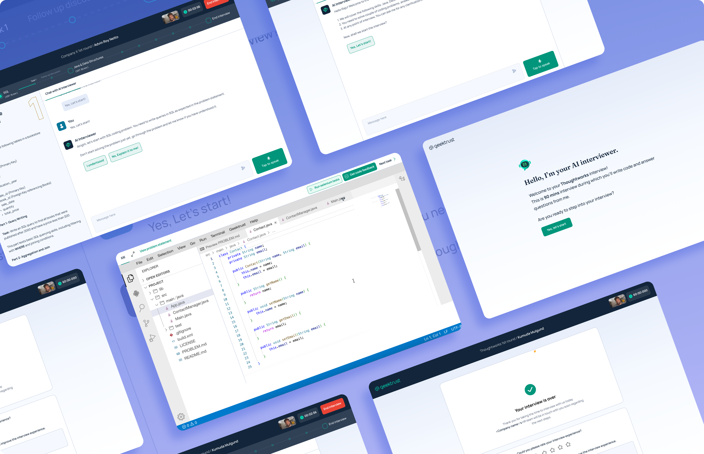
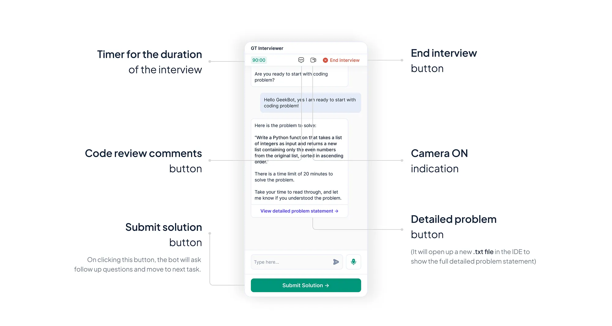
This is the first screen users see when they land on the AI Interviewer.
The AI Interviewer greets them with an
✔ introductory message, explaining the structure of the interview, and
✔ asking if they are ready to begin
⬇️ Header:
Now that we had our own full-fledged product, I included a header to:
✔ enhance branding,
✔ incorporate main action items, and
✔ add essential UI elements.
The header also improves :
✔ accessibility by providing a structured layout,
✔ ensuring a cohesive and user-friendly experience.
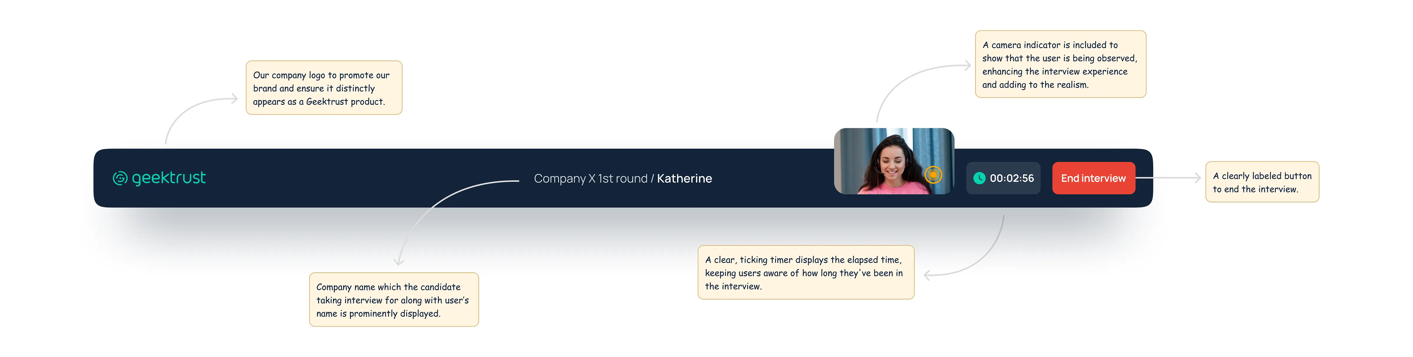
Image: Header consisting of UI elements
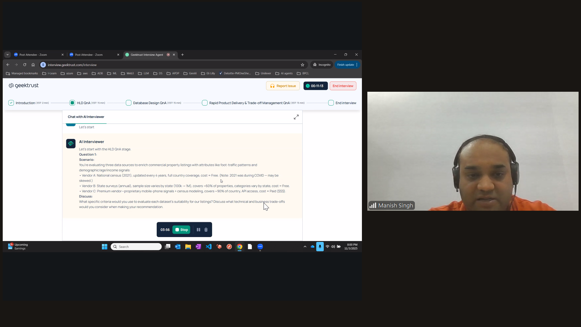
⬇️ Progress bar:
Based on user feedback and observing their struggles with the flow and lack of awareness about their current stage in the interview process, we decided to improve transparency.
After internal discussions, I implemented a progress bar to clearly
✔ highlight all stages of the interview and
✔ how users exactly where they are in the process.
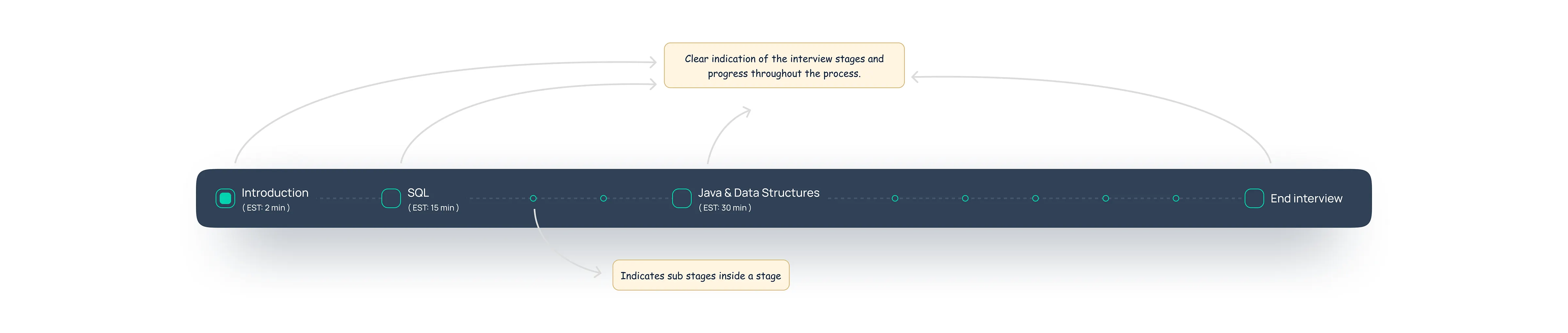
Image: Progress bar with different stages of the interview
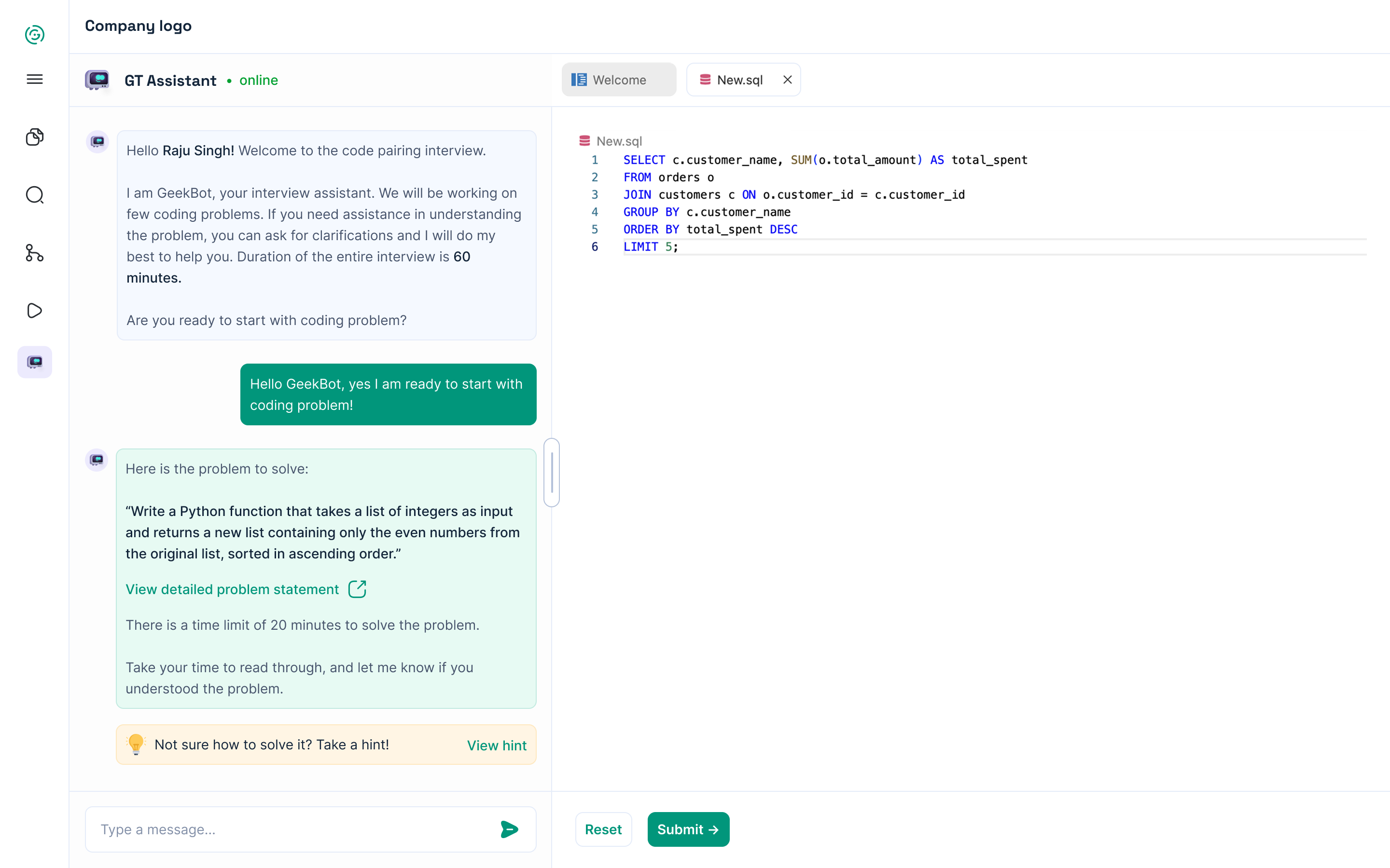
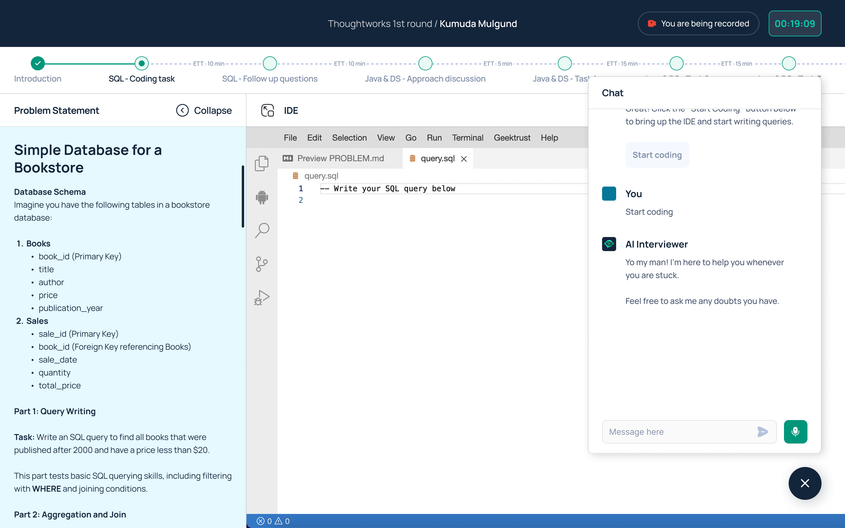
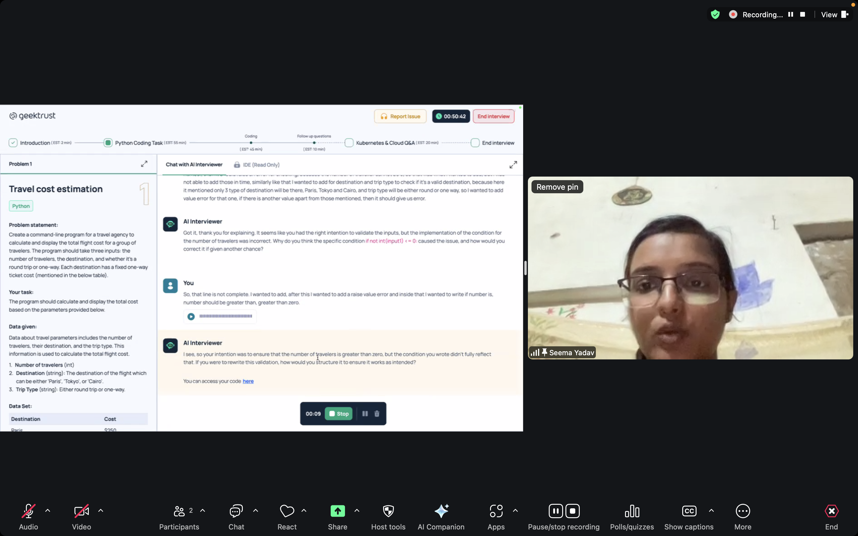
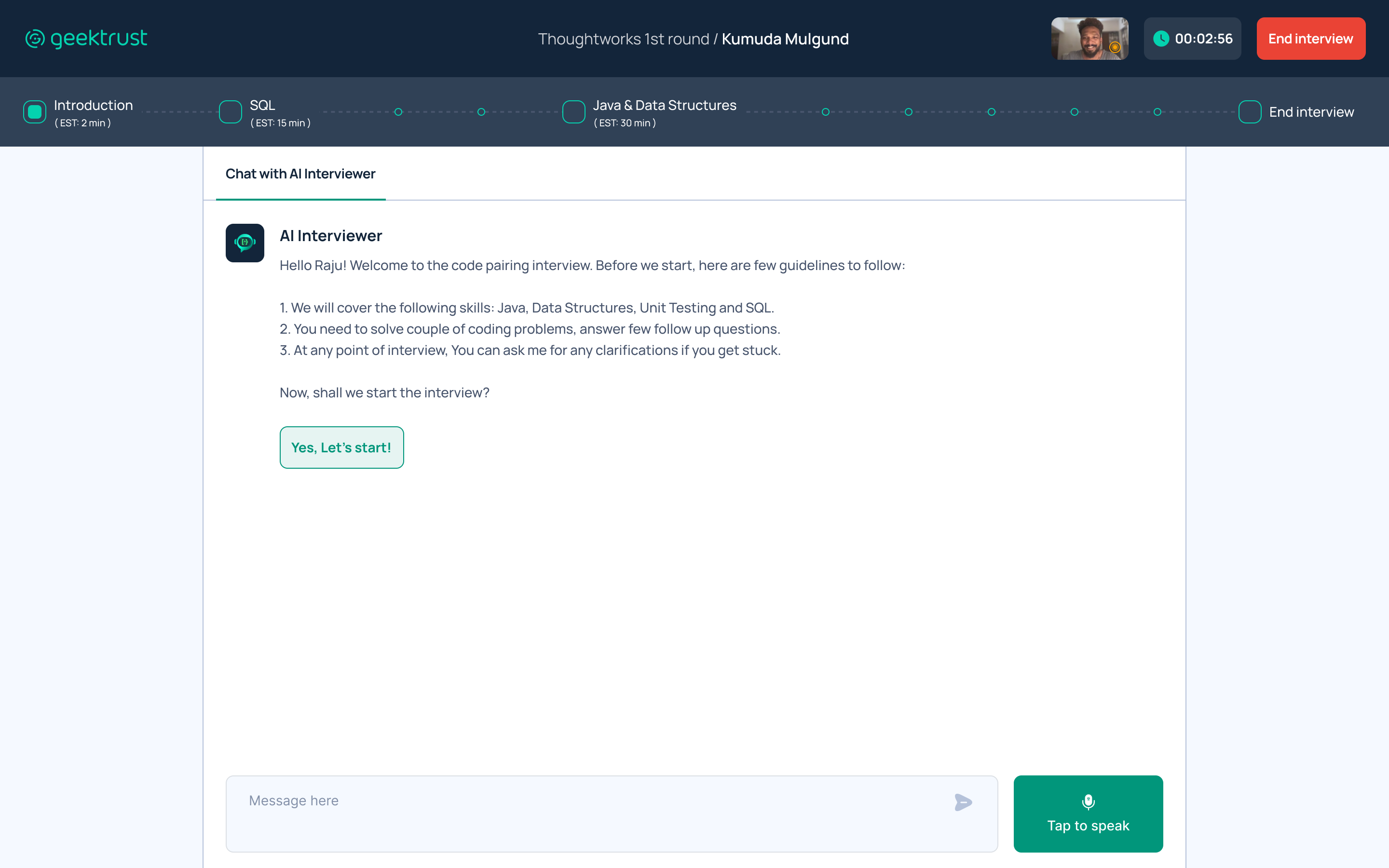
3. Presenting the coding problem
Once the user clicks “Let’s start” or says “I’m ready,” the AI Interviewer presents the first coding problem in a side panel that slides in from the left.
✔ The user can read the detailed problem statement and ask any questions to the AI Interviewer on the right side of the screen.
✔ Additionally, the AI Interviewer checks via message if the user has understood the problem statement.
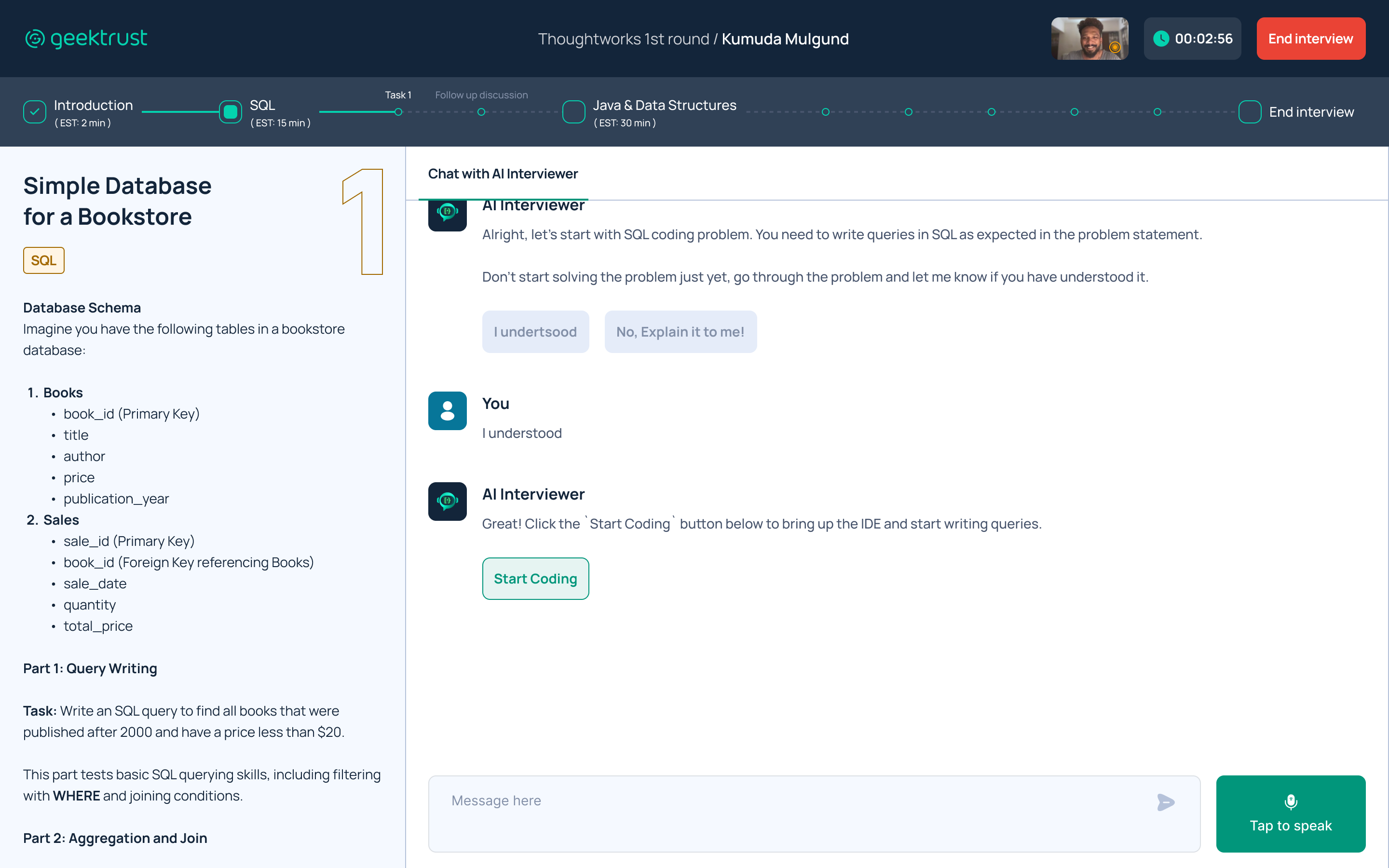
⬇️ Problem statement:
I have made the coding problem statement sticky, ensuring it remains accessible throughout the task, whether you are in the IDE or the main chat.
Additionally, the problem title, language, problem number, and details are clearly highlighted and well-formatted for easy reference.
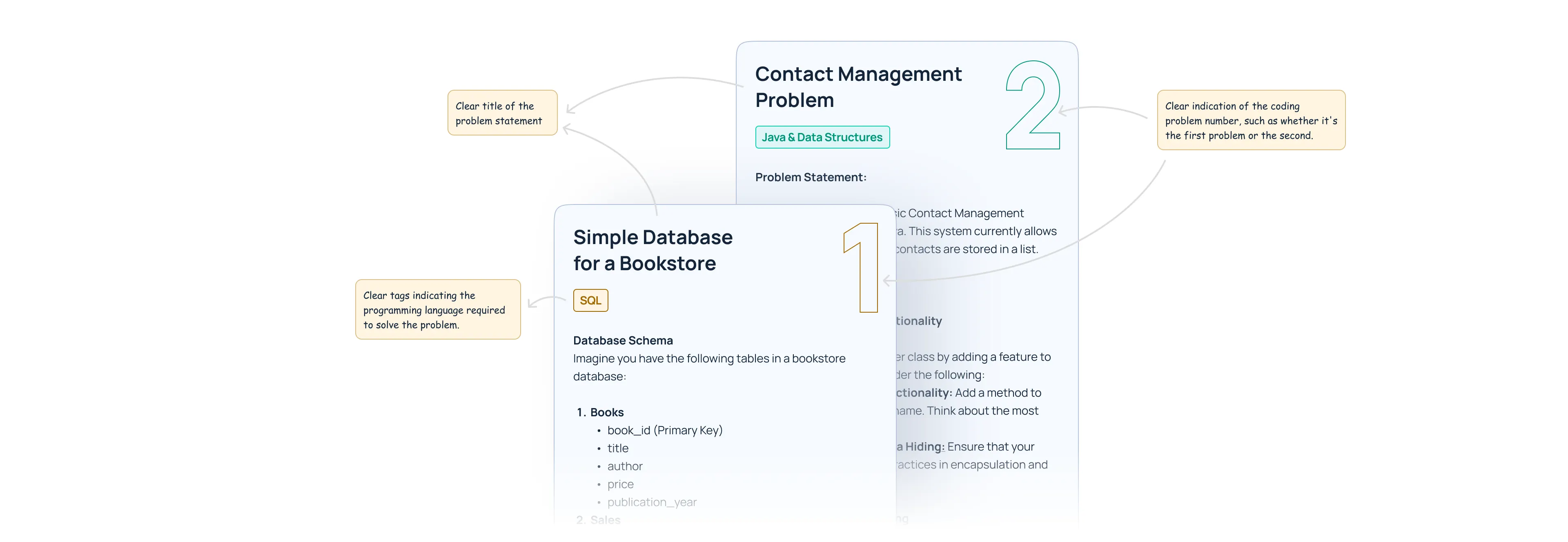
Image: Examples of different coding problem
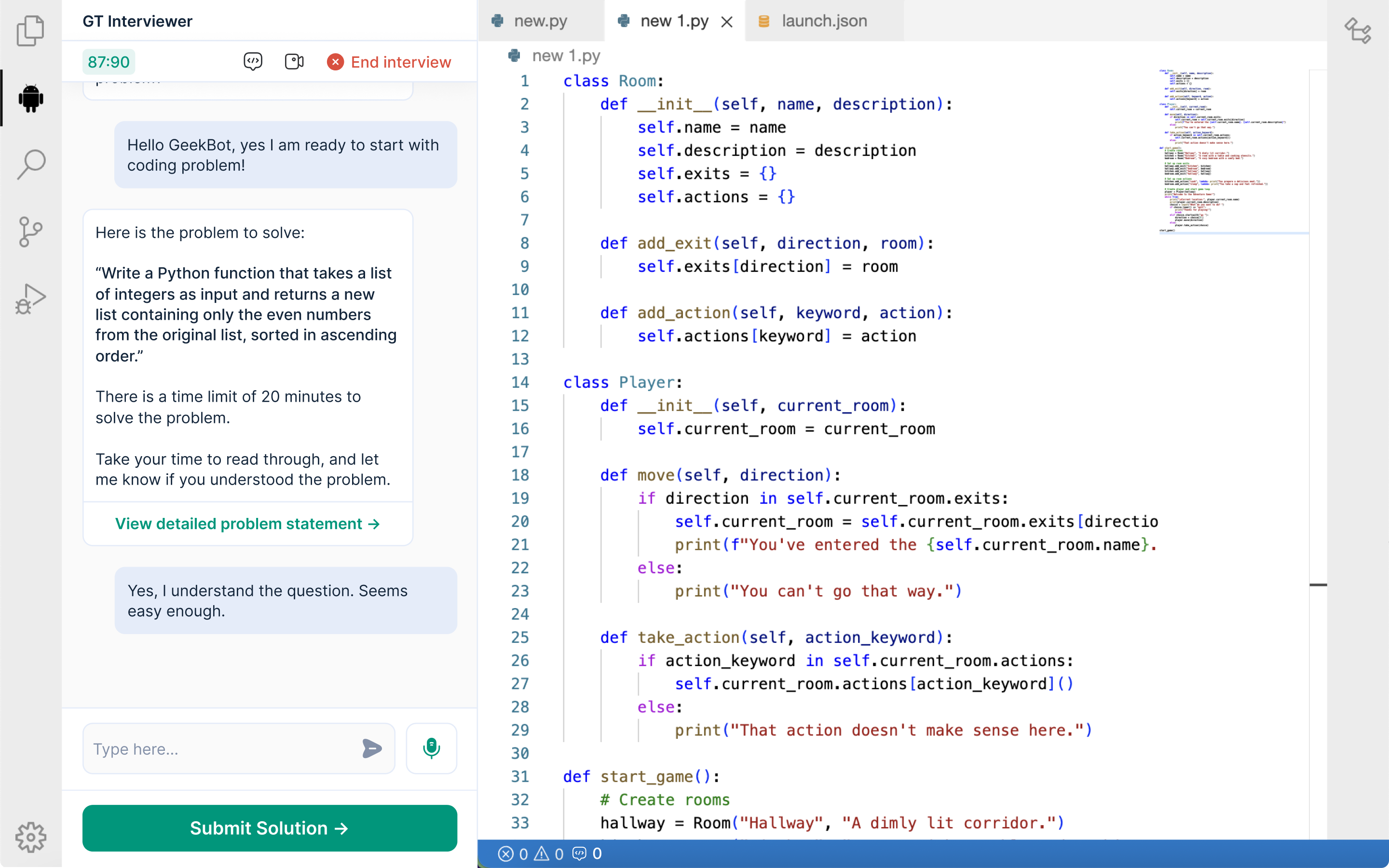
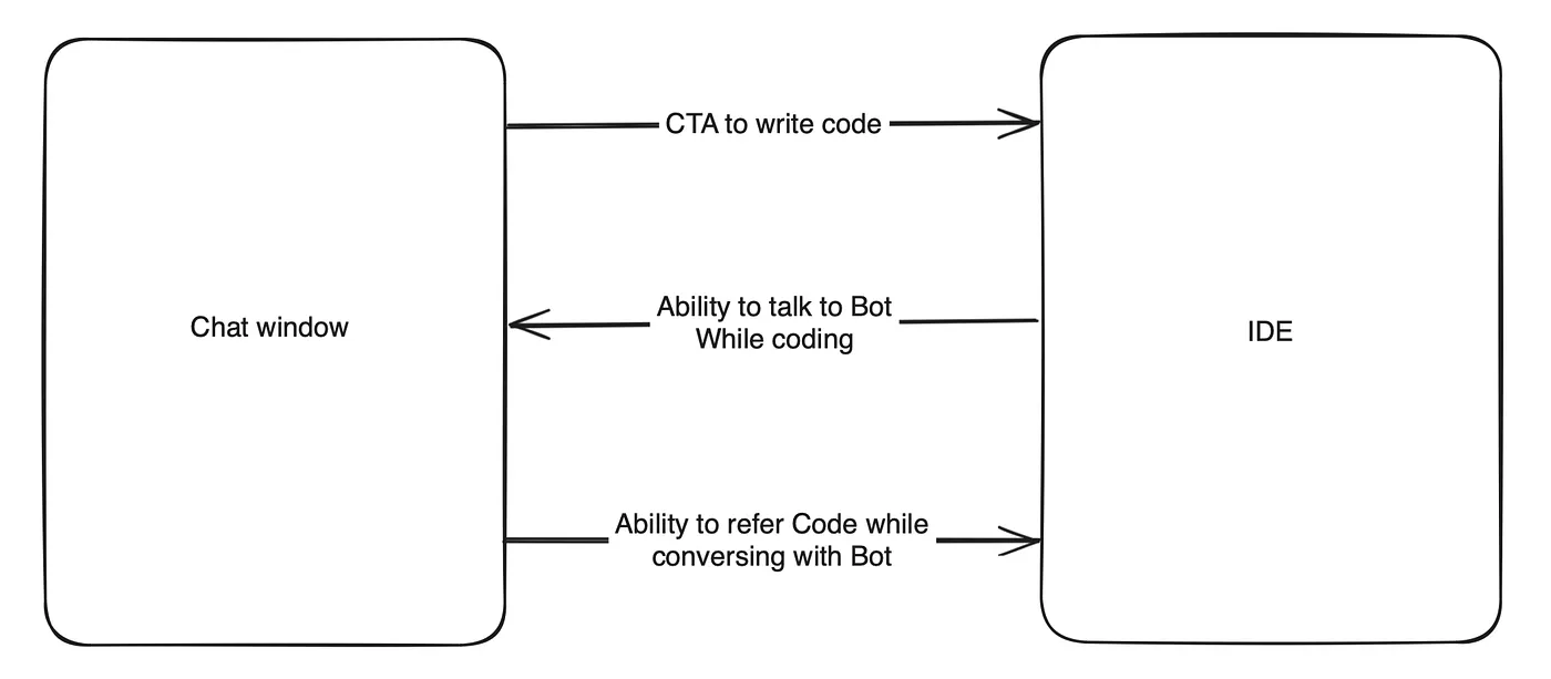
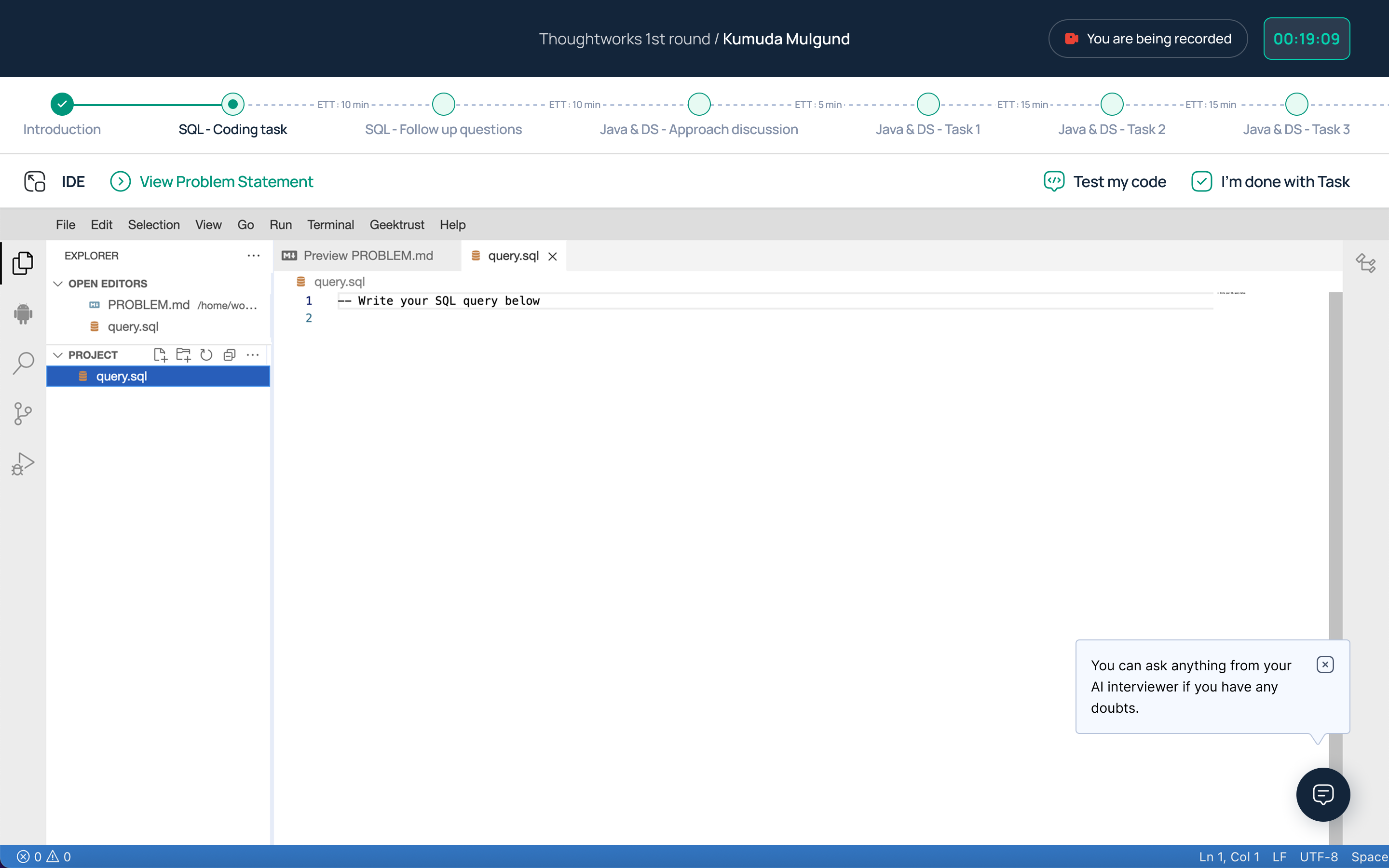
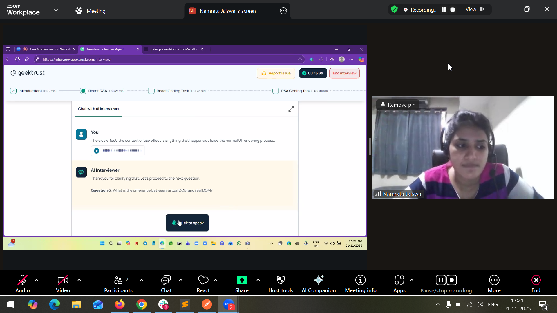
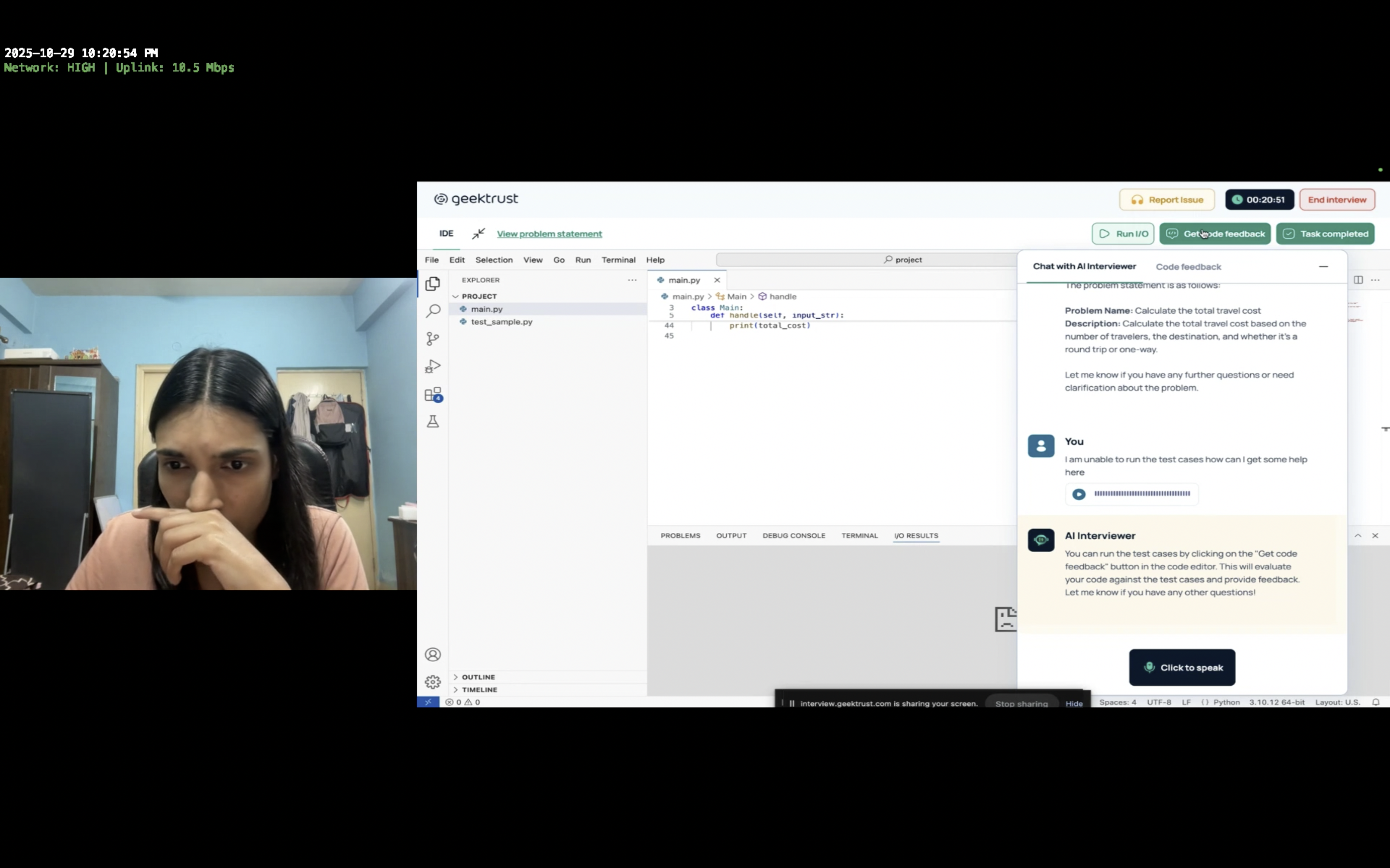
4. Bringing the IDE into Action
Once the user understood the problem, they can click on the “Start coding” button presented by the AI Interviewer to bring up the IDE.
⬇️ How IDE works?
1. Loading IDE
• Show tips on coding, file access, and IDE use while loading.
2. IDE Loaded
• IDE opens in iFrame.
• AI chat collapses to a floating icon, can be reopened anytime.
3. Using IDE
• Write, test, and review code.
• Move to next task or expand IDE to full screen.
All action items and CTAs are conveniently placed at the top of the iFrame, above the IDE, for improved visibility and accessibility.
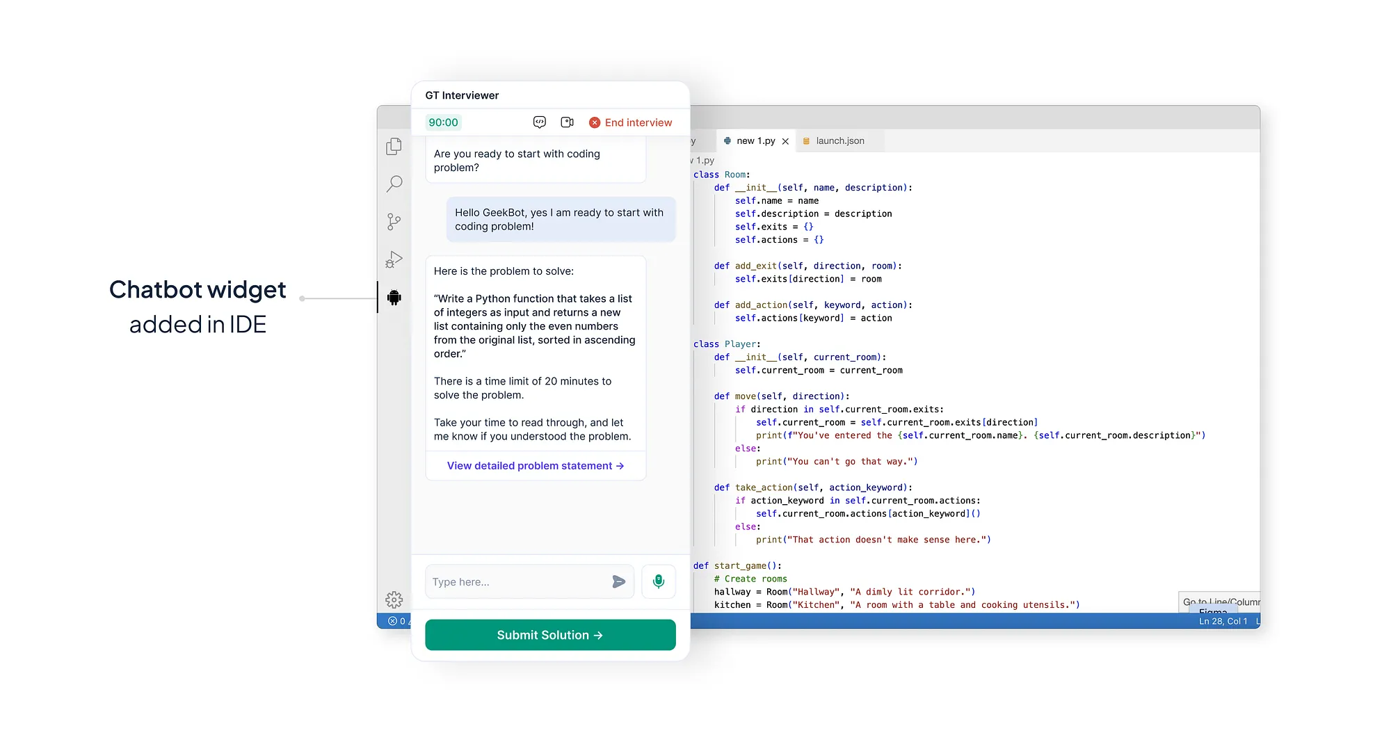
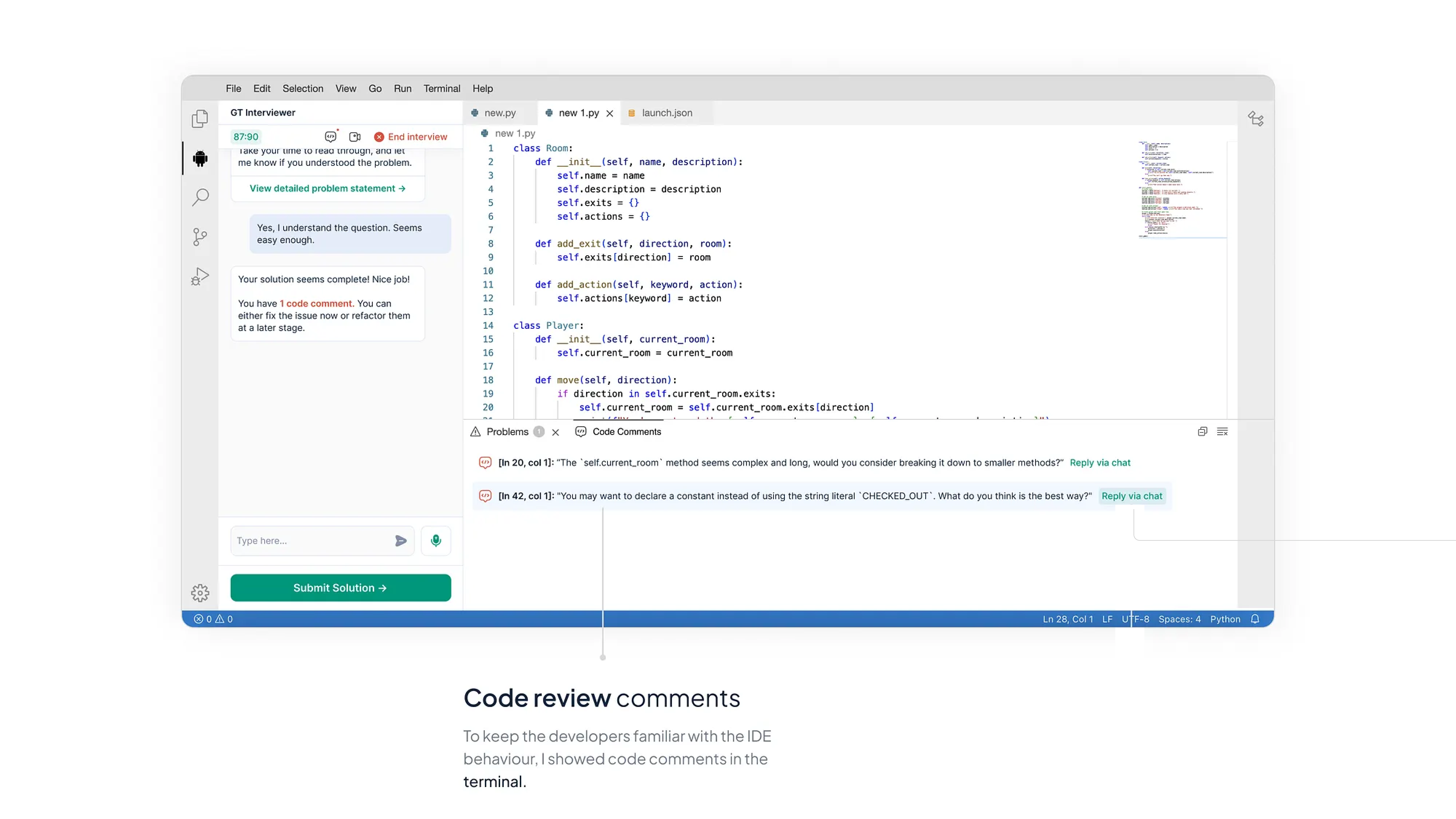
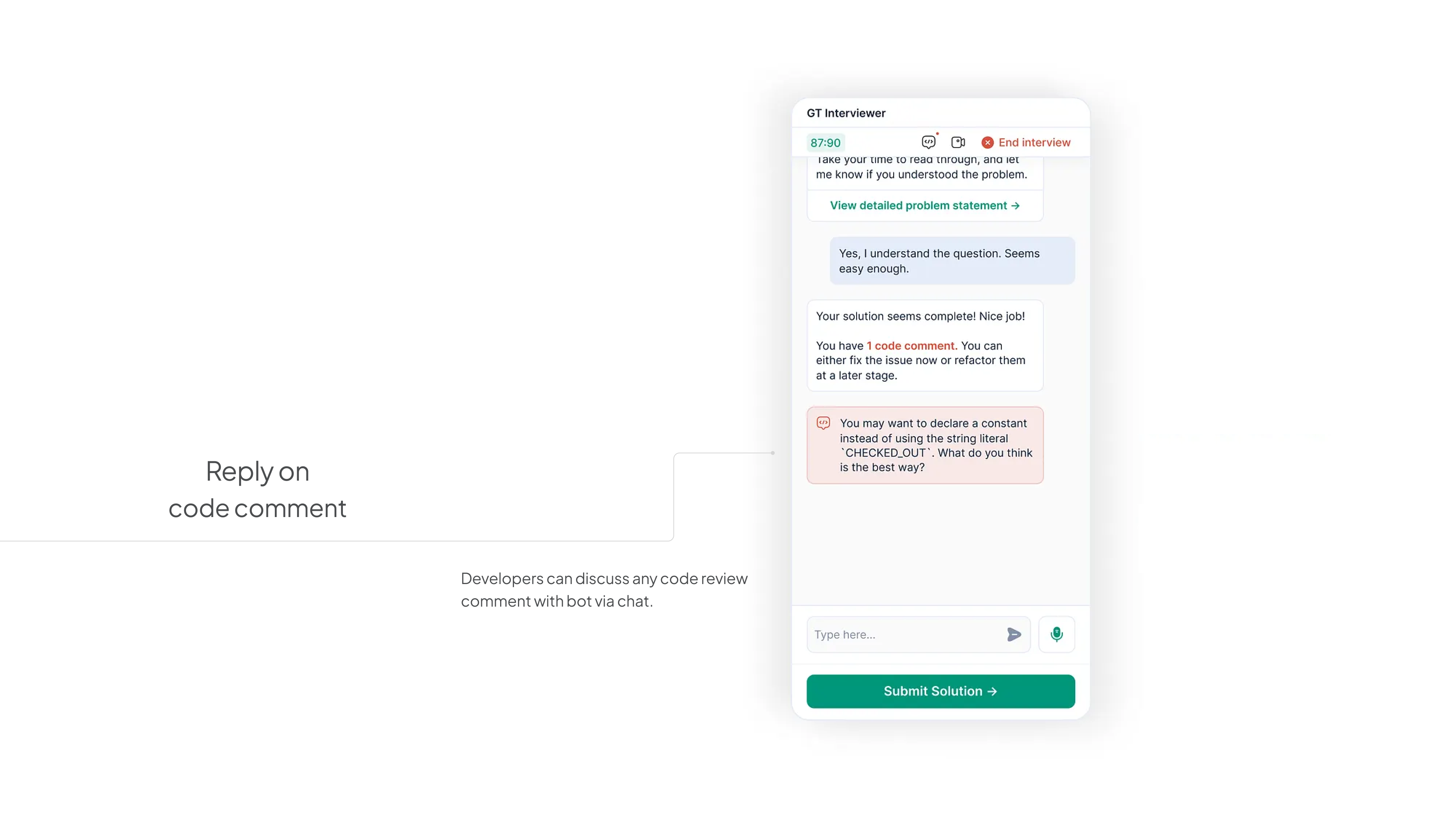
⬇️ Receiving code review comments:
❗️Previously, code review comments were appearing in the terminal on the IDE, disrupting the flow of the coding experience.
To align with the dynamics of a real code pairing interview, where feedback is typically given by the interviewer, I collaborated with the product team to implement a solution.
We decided to display code review comments within the chat interface alongside the AI Interviewer.
To prevent confusion between code comment discussions and regular chat, we introduced separate tabs in the chat:
✔ one for normal conversation with the AI Interviewer and
✔ another dedicated solely to code review comments.
This segregation ensures a clear distinction and facilitates focused discussions on code-related feedback.
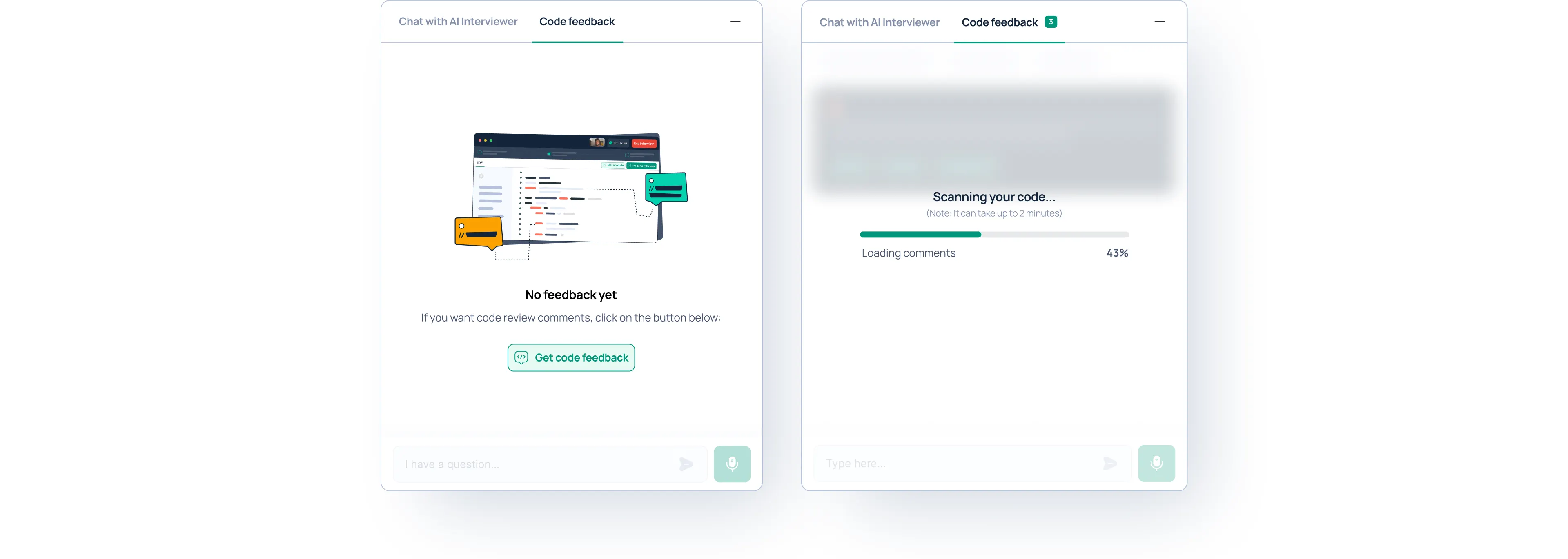
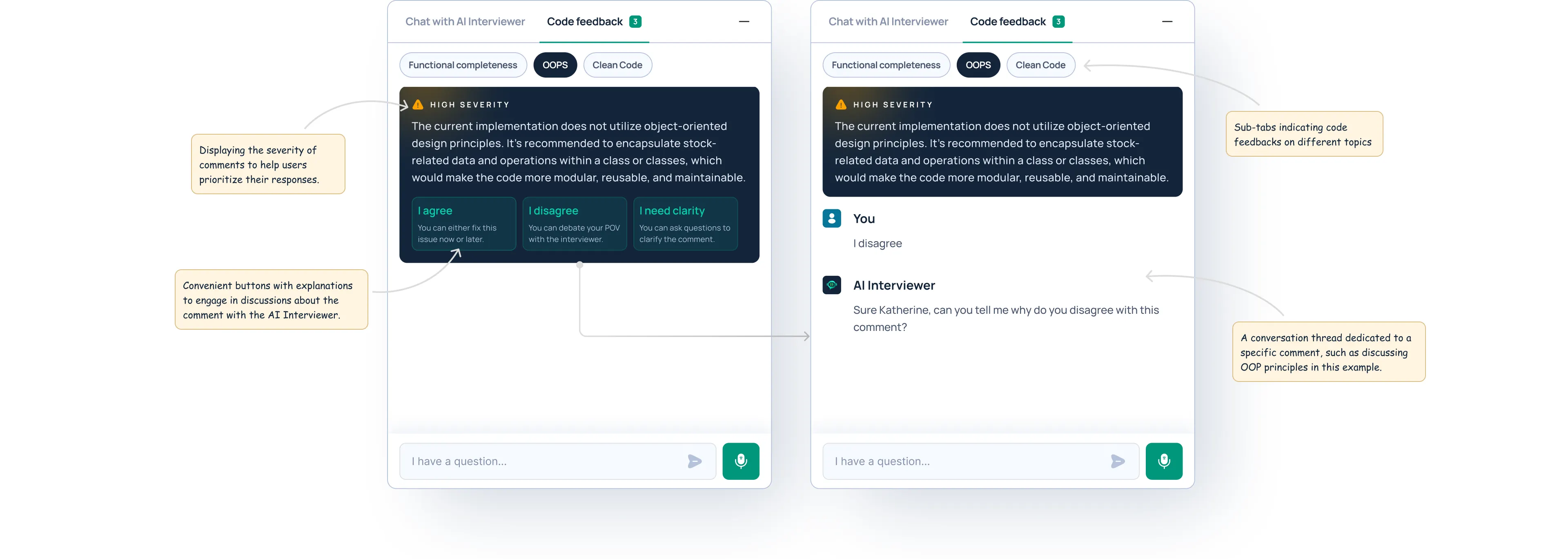
Image: Showing code feedbacks in the chat
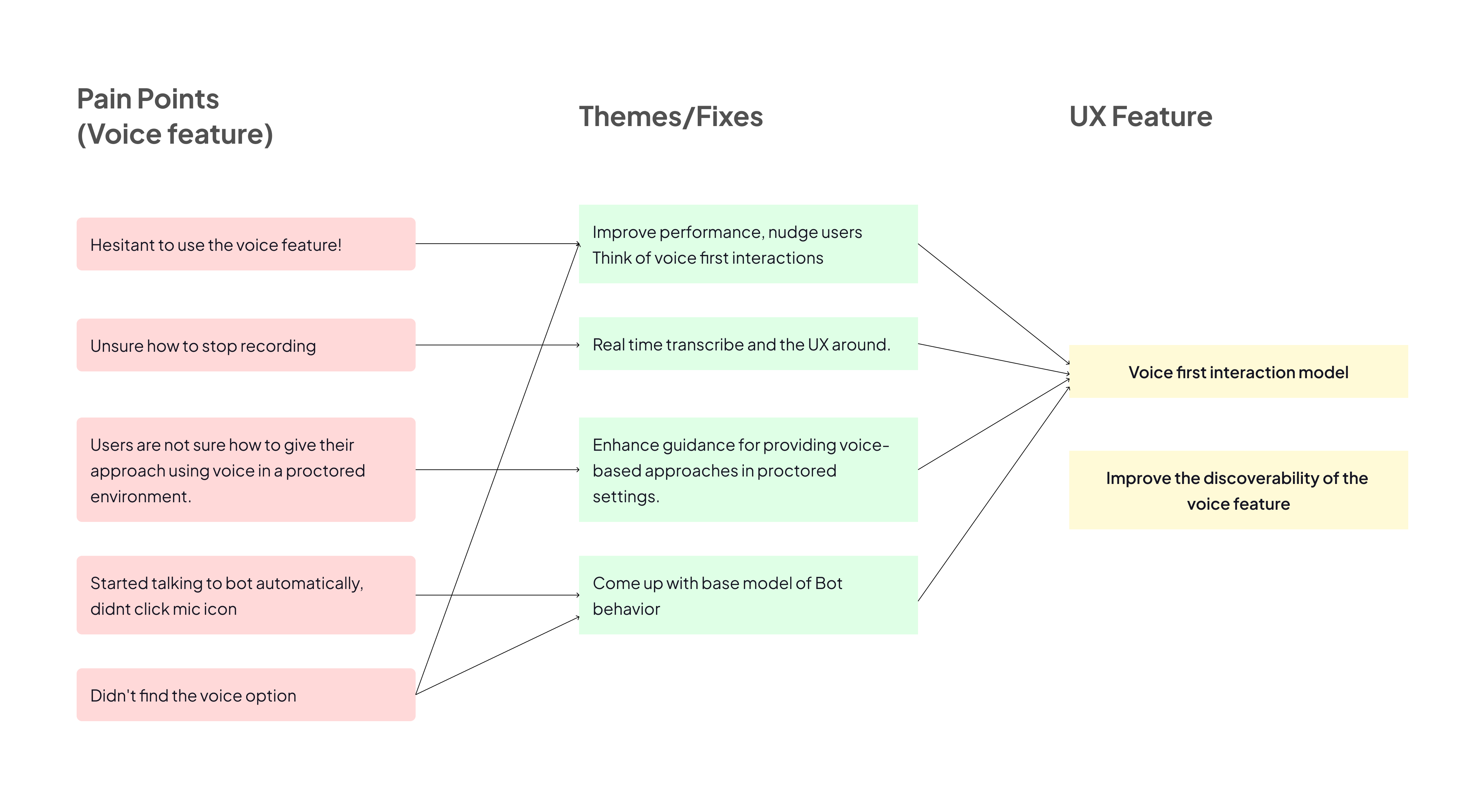
5. Voice interaction
Since voice interaction was a key feature in our product for assessing candidates’ communication skills, I decided to prioritize it.
I identified and categorized all the pain points related to the voice feature, mapping them to specific UX improvements.
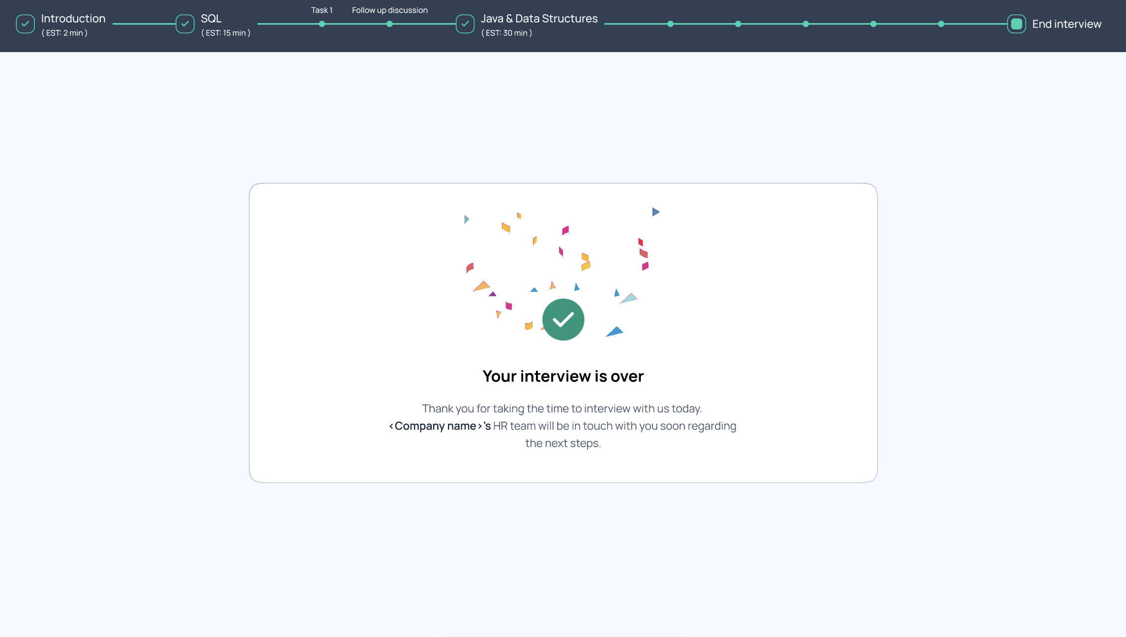
6. End interview