Was the redesign needed? If yes, then why?

Let's analyse the product and see what's not working out?
Dashboard

Issues:
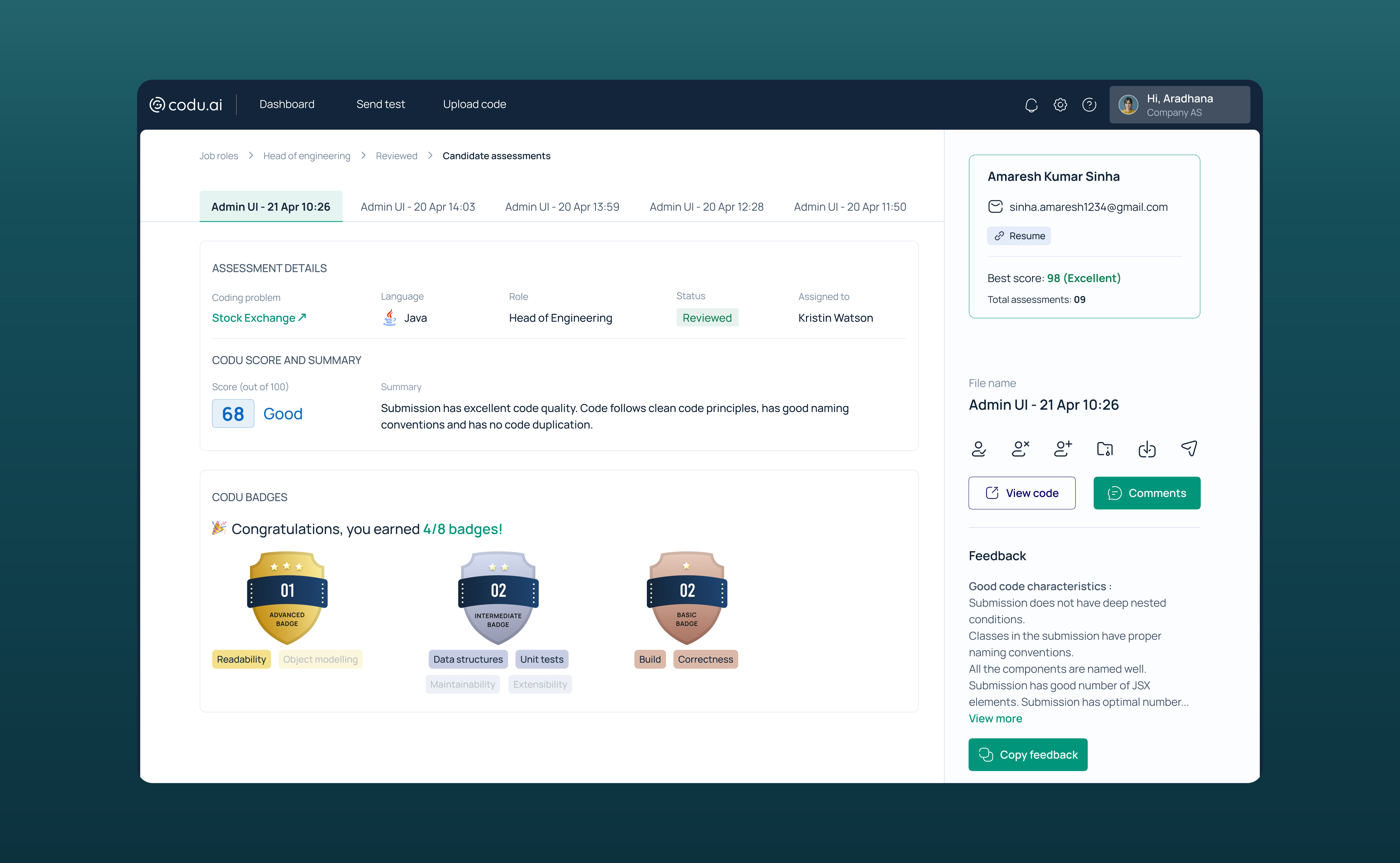
Candidate Assessment Report

Issues:
Other Screens

Issues:
Let's see who the users are and see if they are facing the same thing.


Sumarising pain points of the users from their POV
What do users expect from Codu?
What is missing in Codu/ what needs to be changed?

Solution ideas:


Well, what all things users can do on Codu?


------------------------------------------------------------------------------------------------------------------------------------------------------------------------------------------------------------------------------------
Depth of the wireframes for clear understanding:
Dashboard

Issues solved:
Listing page- Job role

Issues solved:
Candidate assessment report

Issues solved:

Reason for choosing this colour palette:
Reason for choosing this typeface:
Dashboard


Assessment listing page

Candidate assessment report


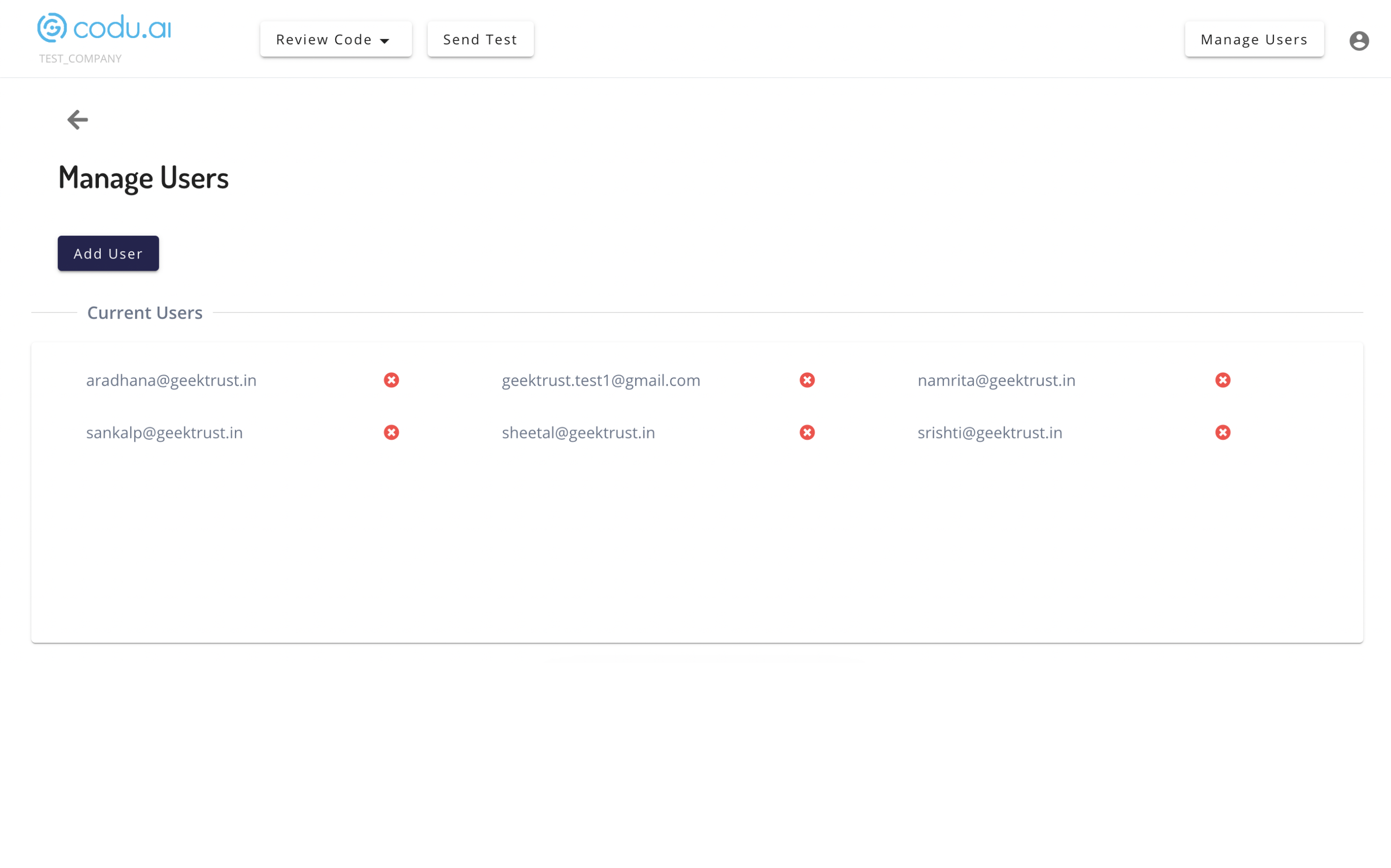
Manage Codu